360° BRAND CASE STUDY
JCN Construction
Every strategic choice, from color psychology and typographic weight to website architecture and social content pillars, was made with purpose and precision, ensuring JCN Construction's brand communicates trust, strength, and market authority across all physical and digital touchpoints.
Logo Redesign (Before & After)
Comparing the previous logo mark with the new visual identity highlights the strategic evolution toward a bolder, more authoritative, and high-impact brand presence.
Typographic selection & custom refinements
Centrifuge was selected for its robust structure and high-density visual weight, creating a foundation of immediate strength and presence for the identity. Its industrial strokes and precise joints translate the technical rigor of JCN Construction — a typography chosen not by trend, but through direct alignment with those who build with method and measurable results.
Architectural synthesis & logo system
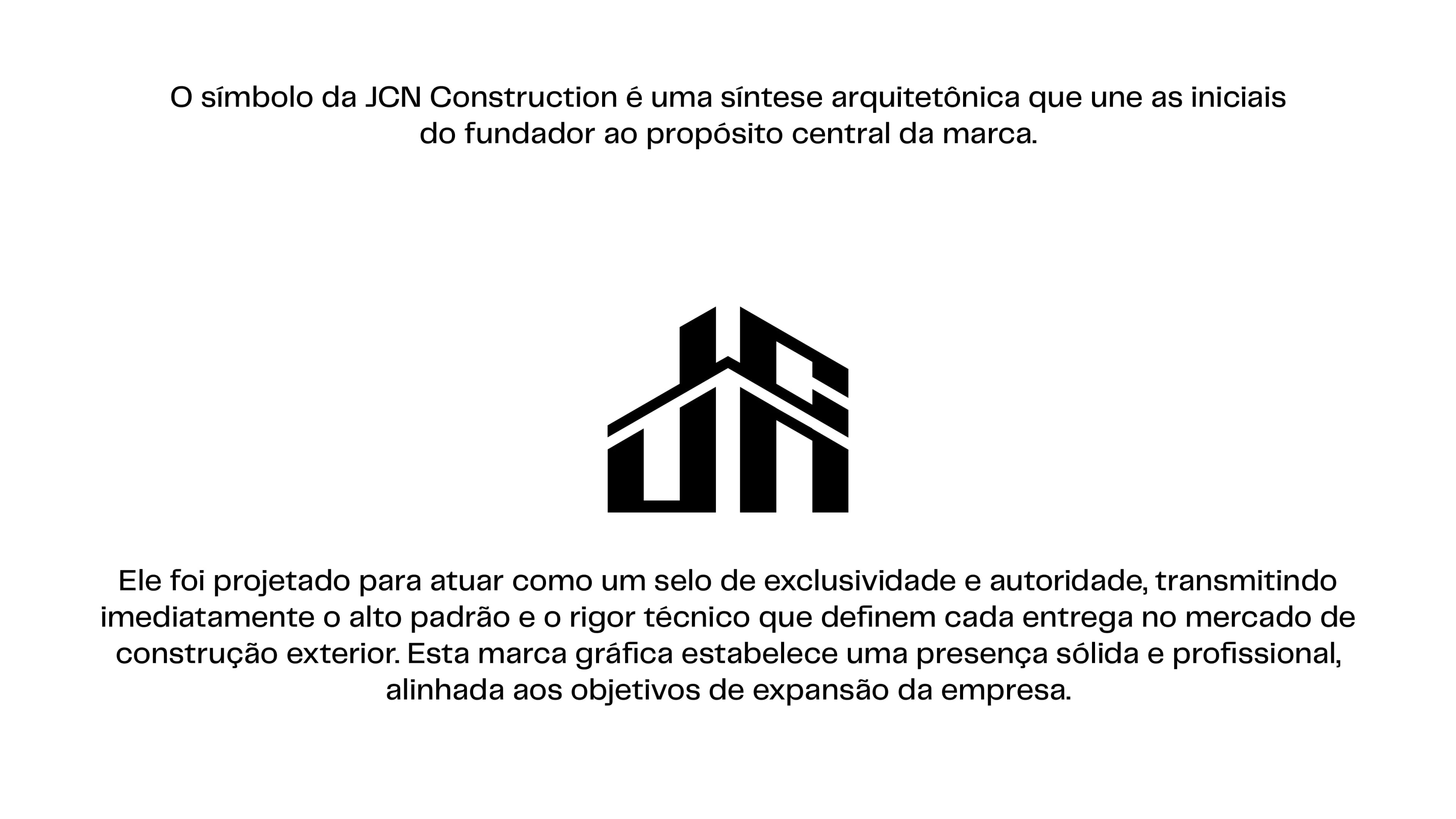
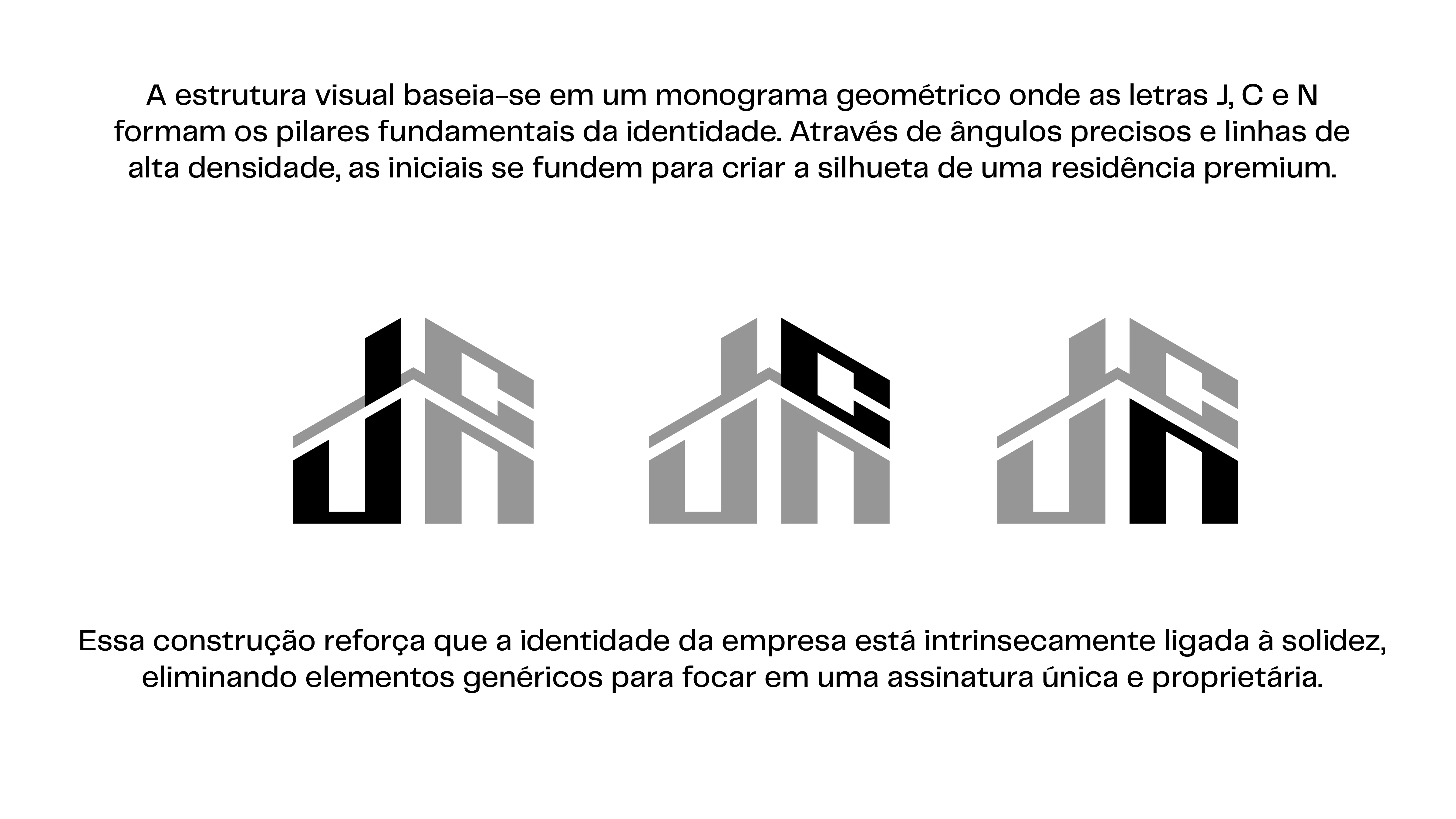
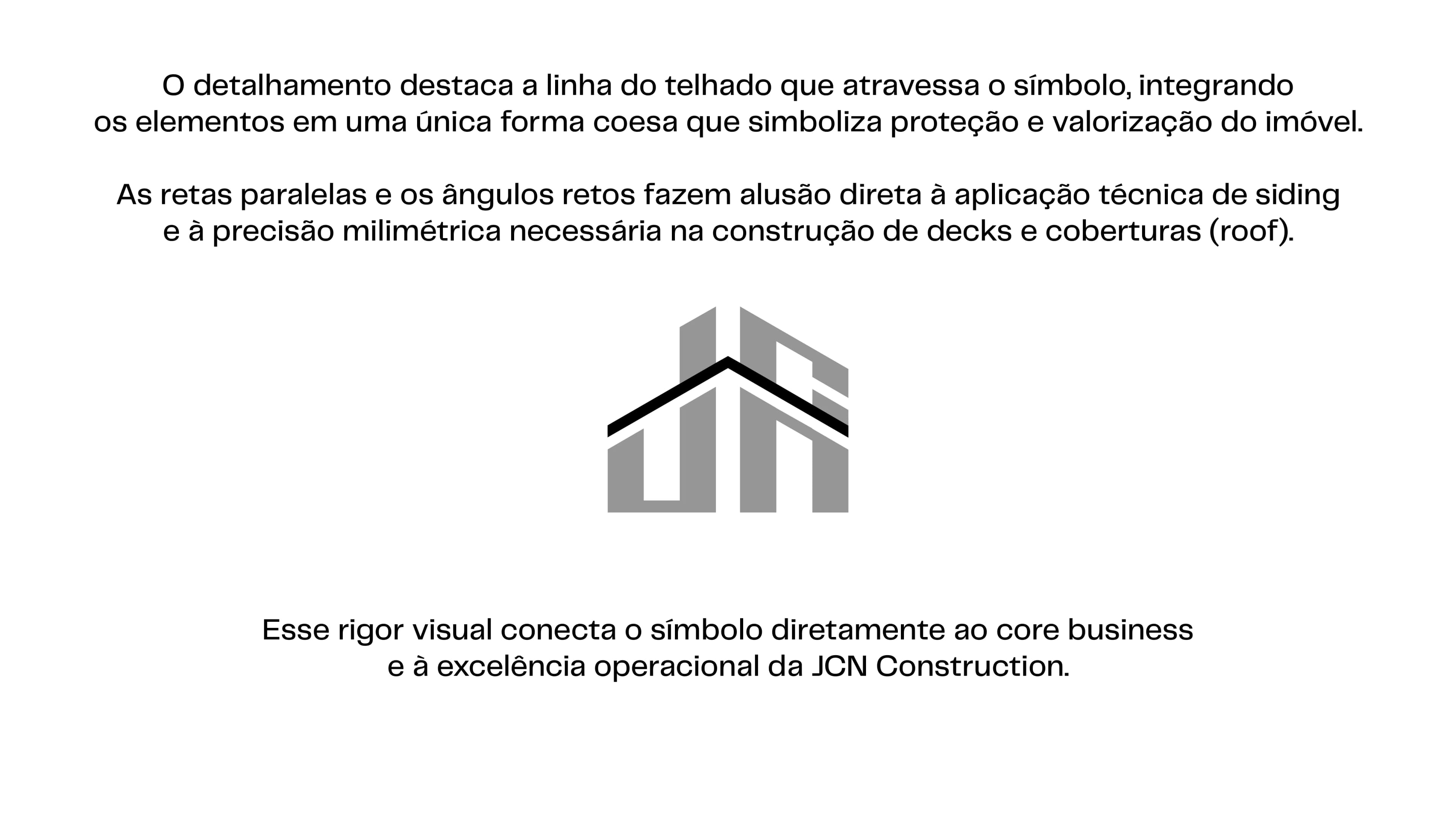
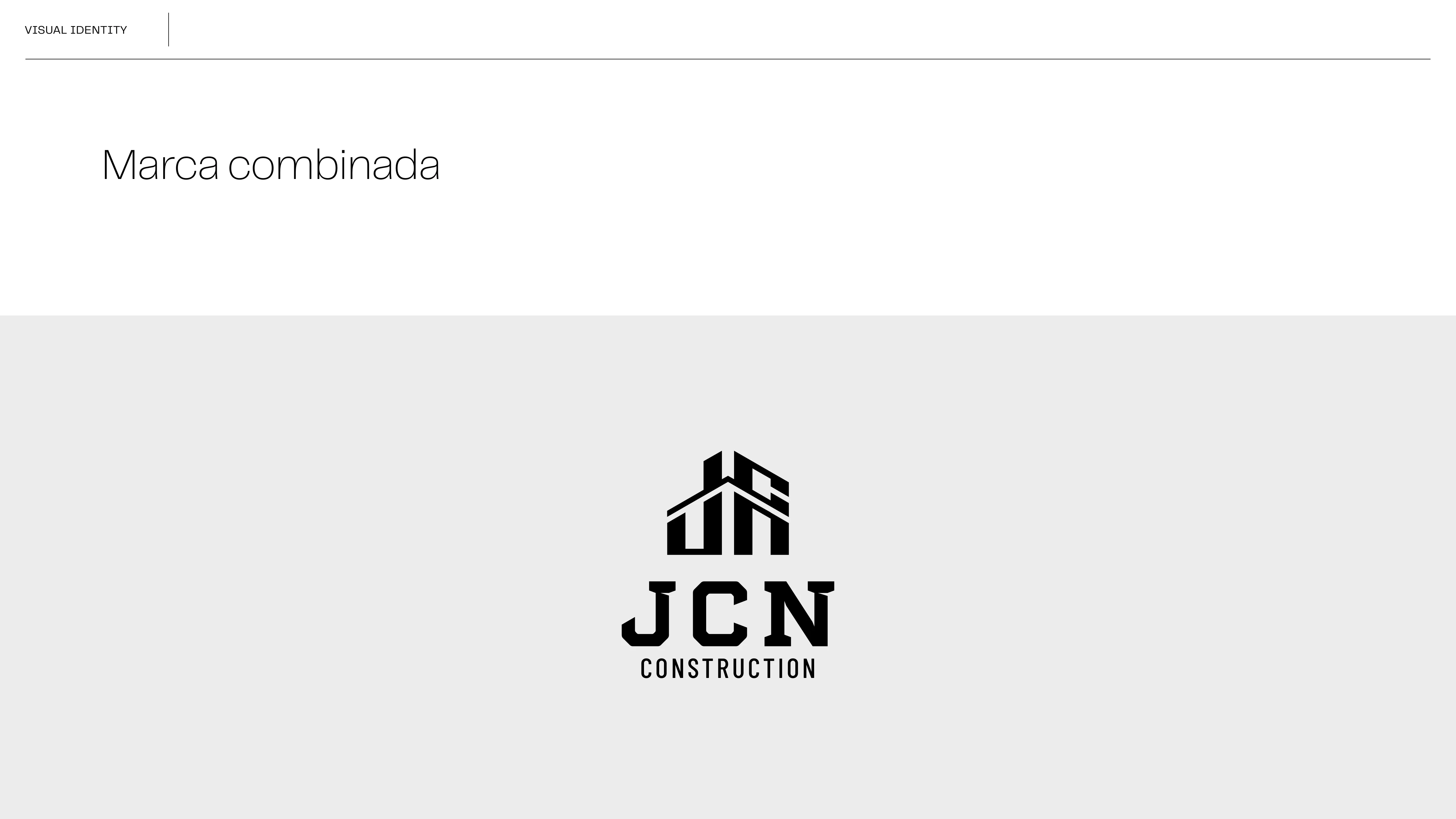
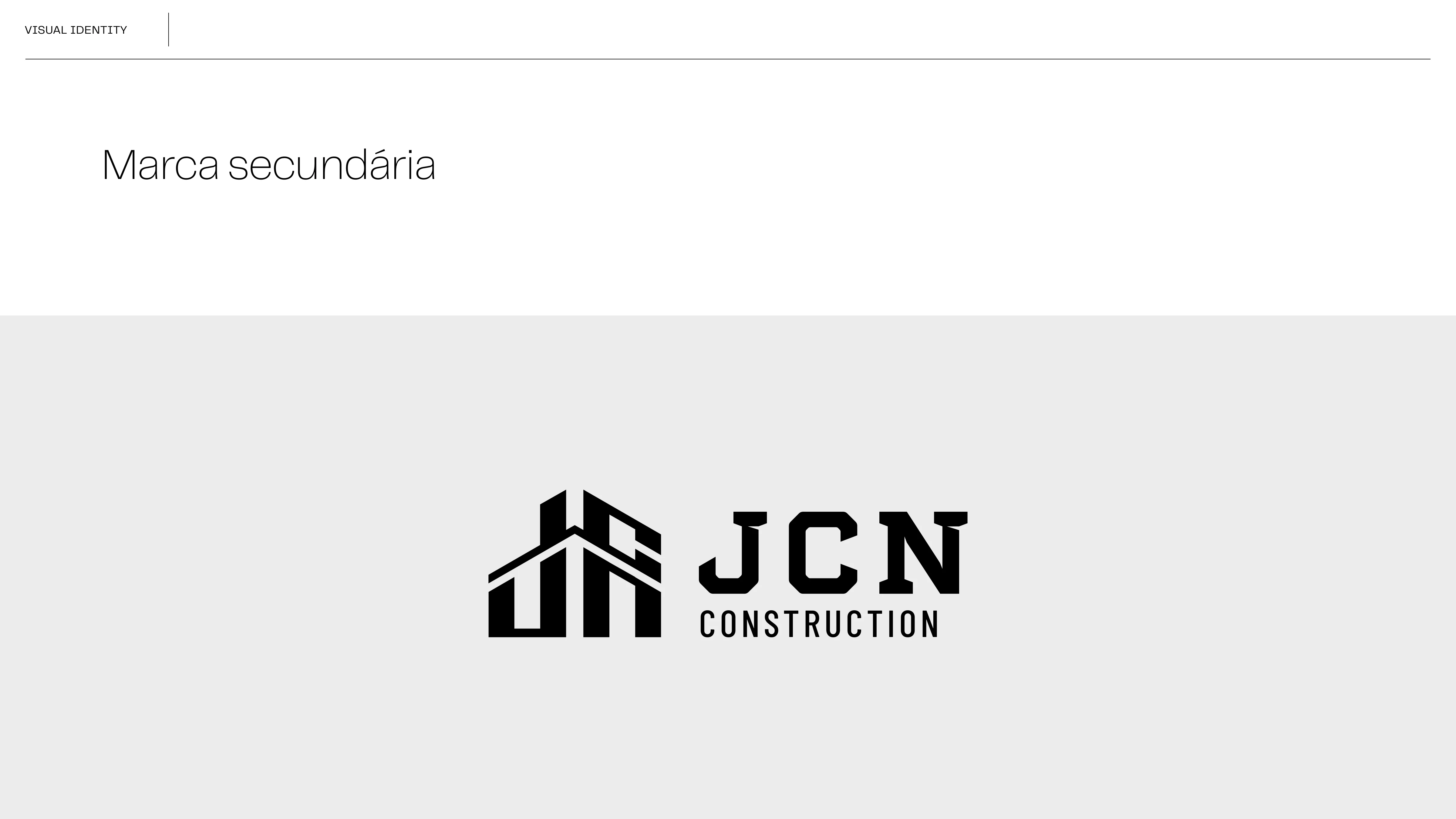
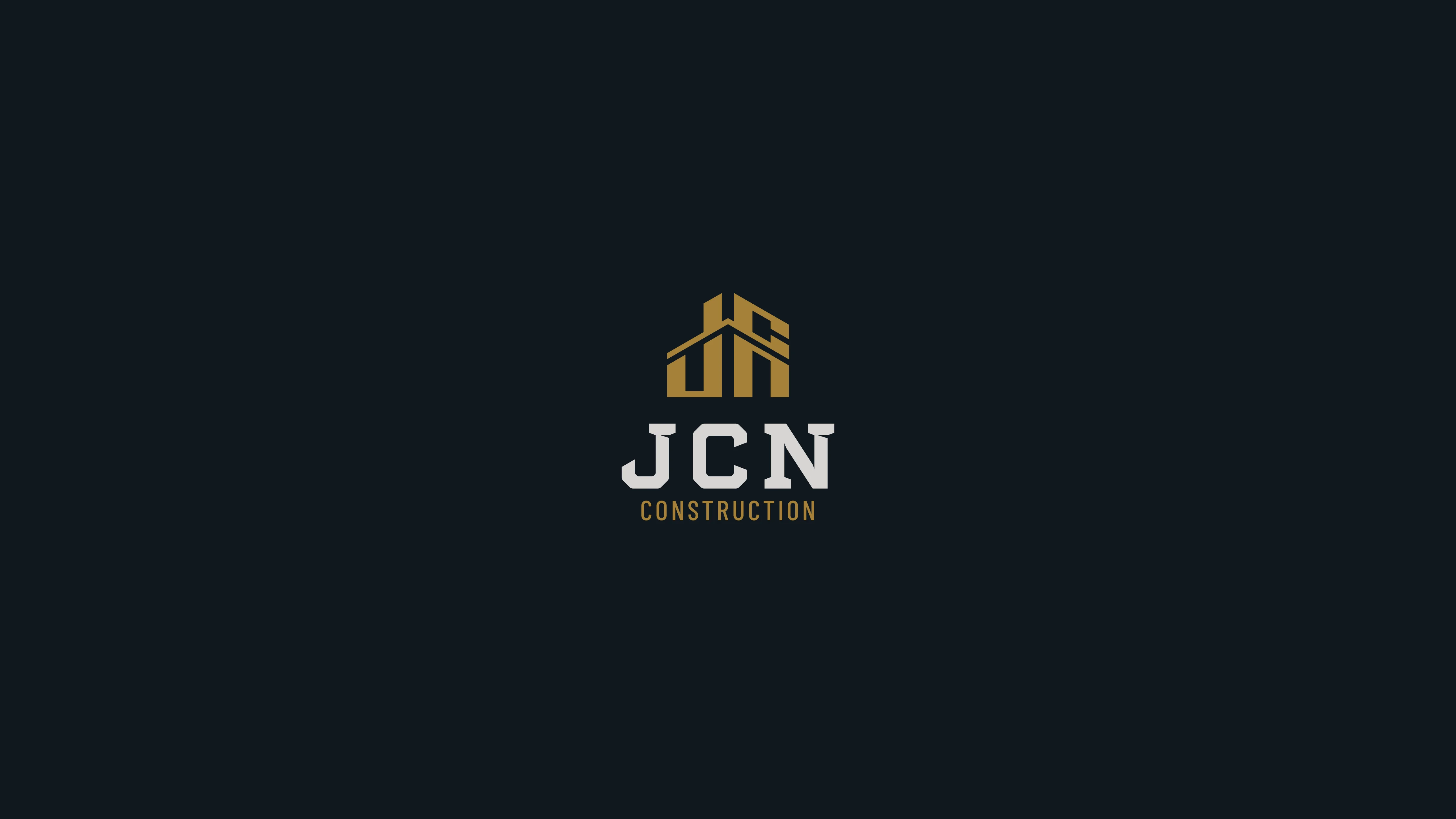
The JCN Construction symbol is an architectural synthesis uniting the founder's initials with the core purpose of the brand. Designed to act as a mark of exclusivity and authority, it immediately projects the technical rigor and high standards defining every delivery in the premium exterior construction market — establishing a solid, professional presence aligned with the company's expansion goals.
Official Website
StudioC engineered a custom, high-converting website for JCN Construction to solve a major operational challenge: their previous online form was flooded with automated bot spam. By implementing advanced anti-spam verification and honeypot protection, we completely eliminated spam submissions while optimizing the platform for local Massachusetts SEO, mobile-first performance, and direct high-intent lead conversion.
Brand Content & Audience Engagement
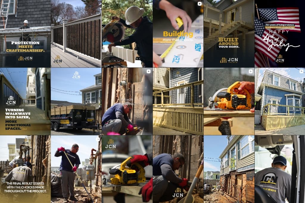
A targeted Instagram content and video strategy engineered to showcase proof of craftsmanship, project transformations, and build immediate market authority.
Brand Colors
The core gold associates the brand with technical precision and prestige, refined to communicate exclusivity and JCN Construction's high standards of execution. Midnight navy establishes authority as a visual anchor, generating immediate reading contrast across any medium. Ice white and medium gray ensure visual breathing room and a clean aesthetic, translating core pillars such as organization, methodology, and commitment to excellence.

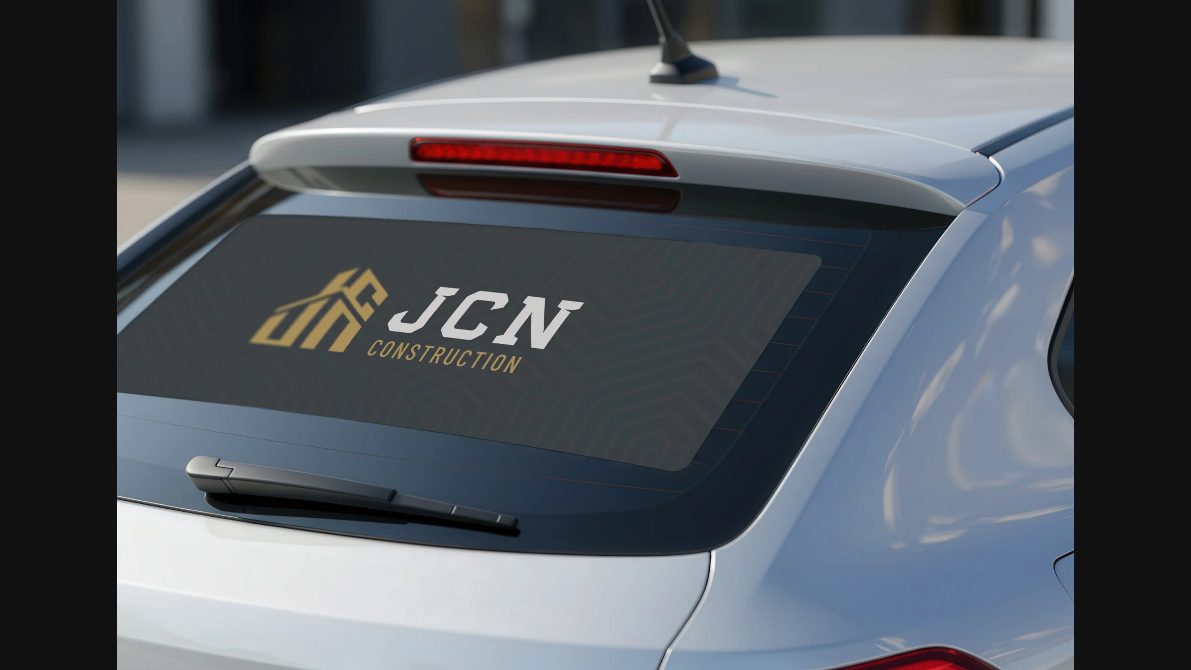
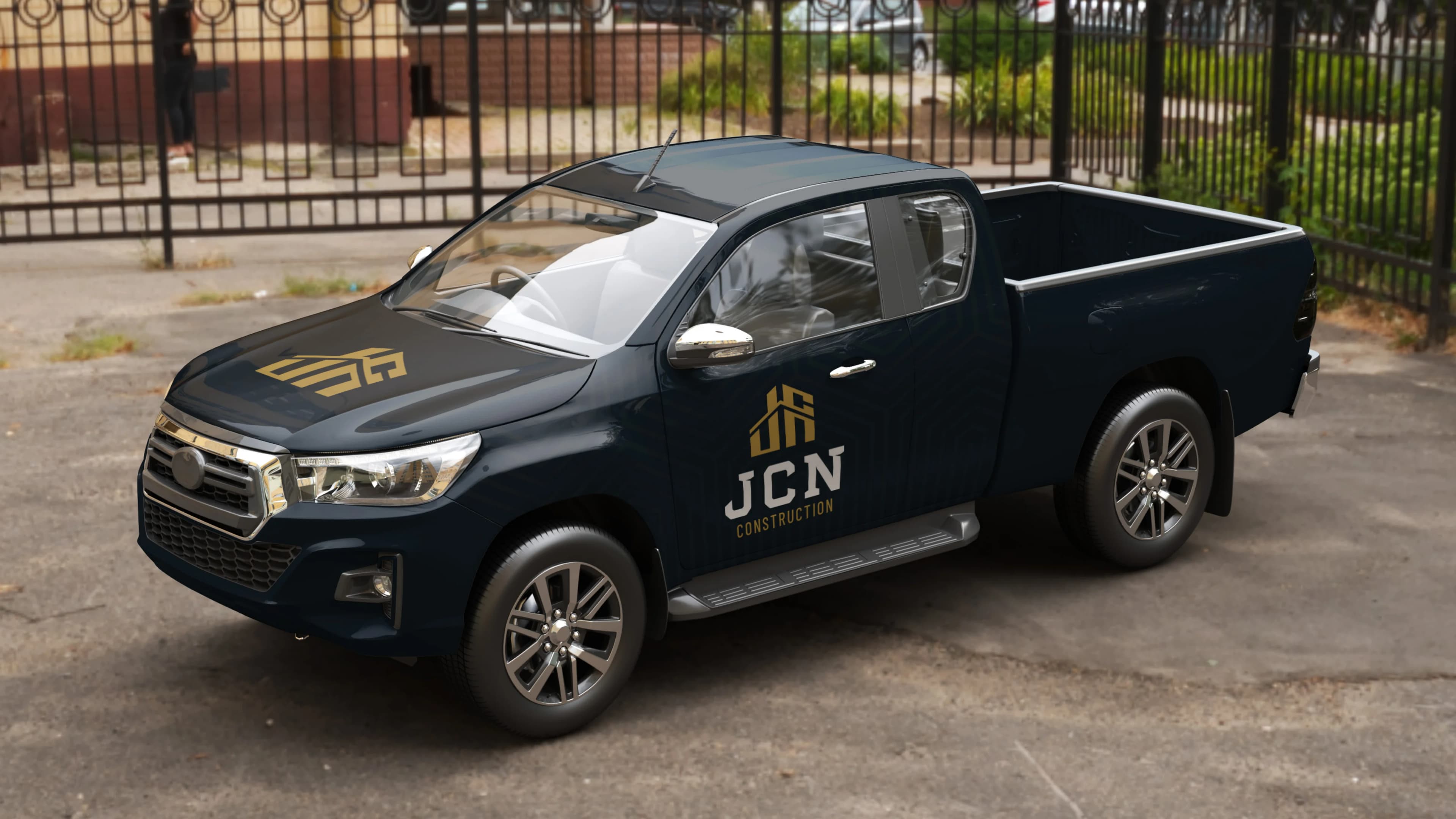
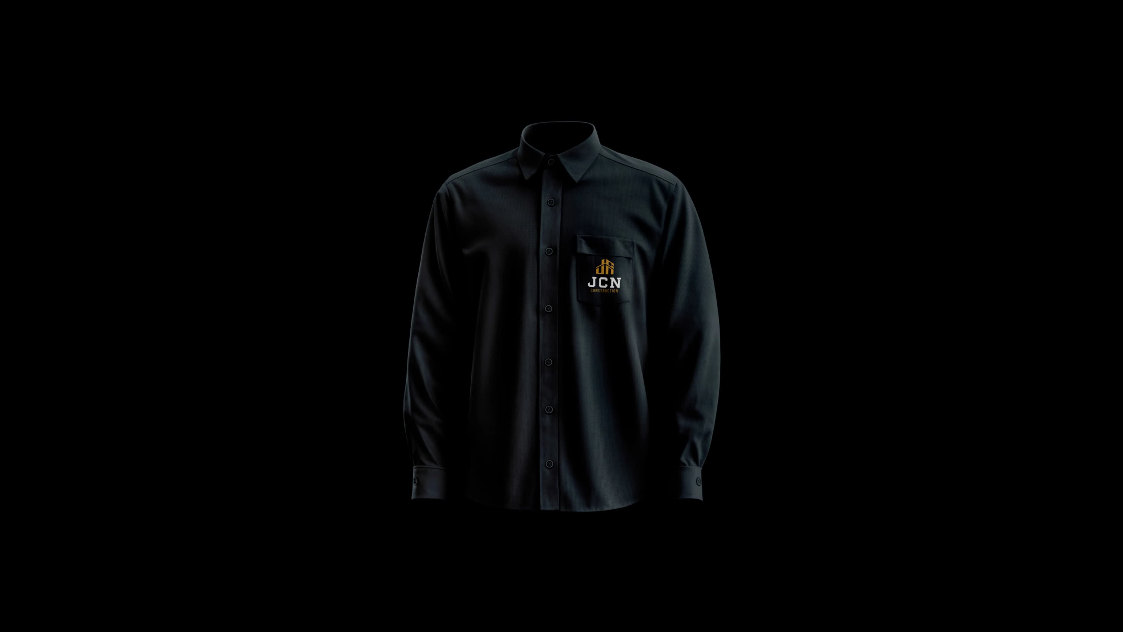
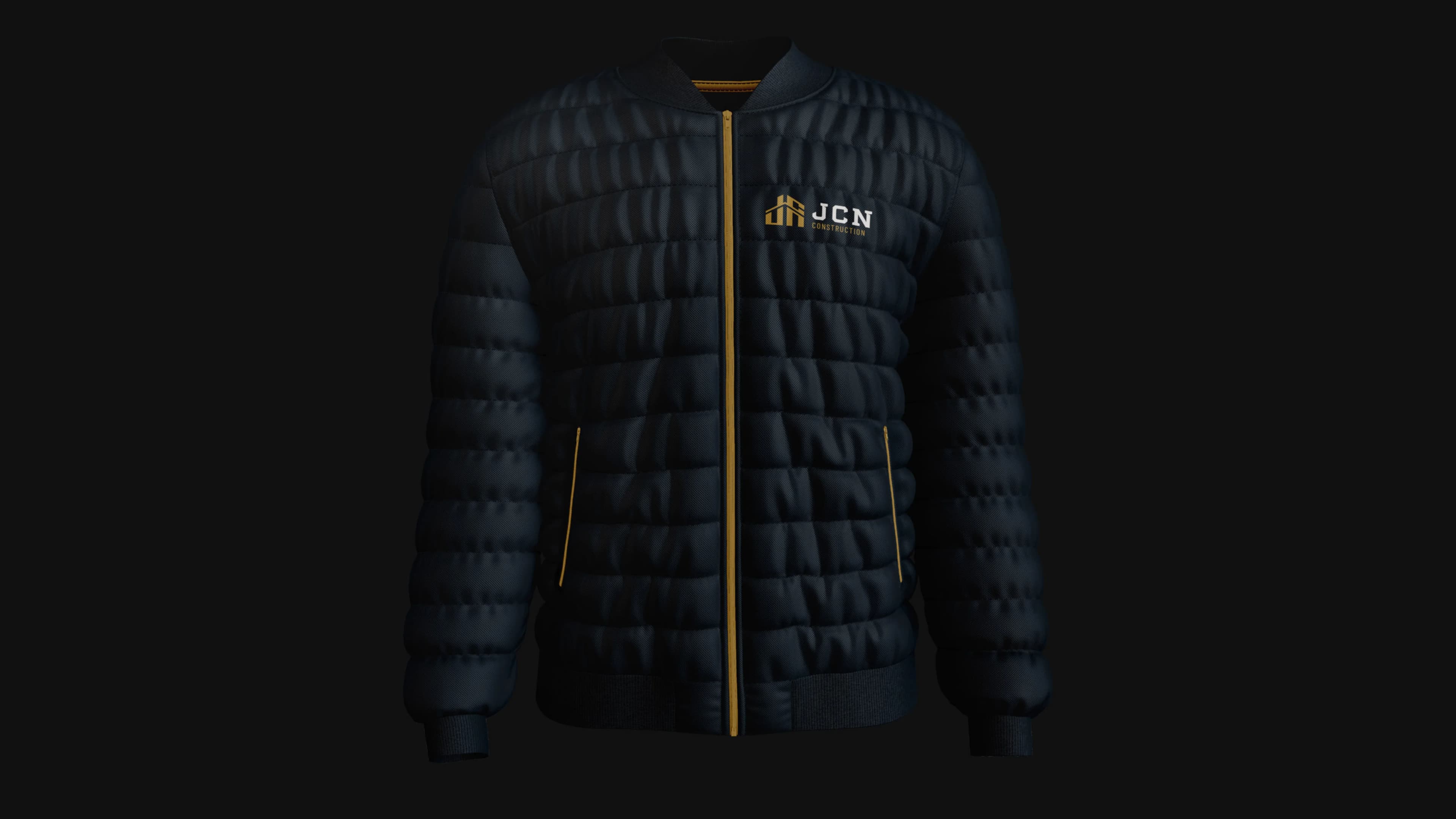
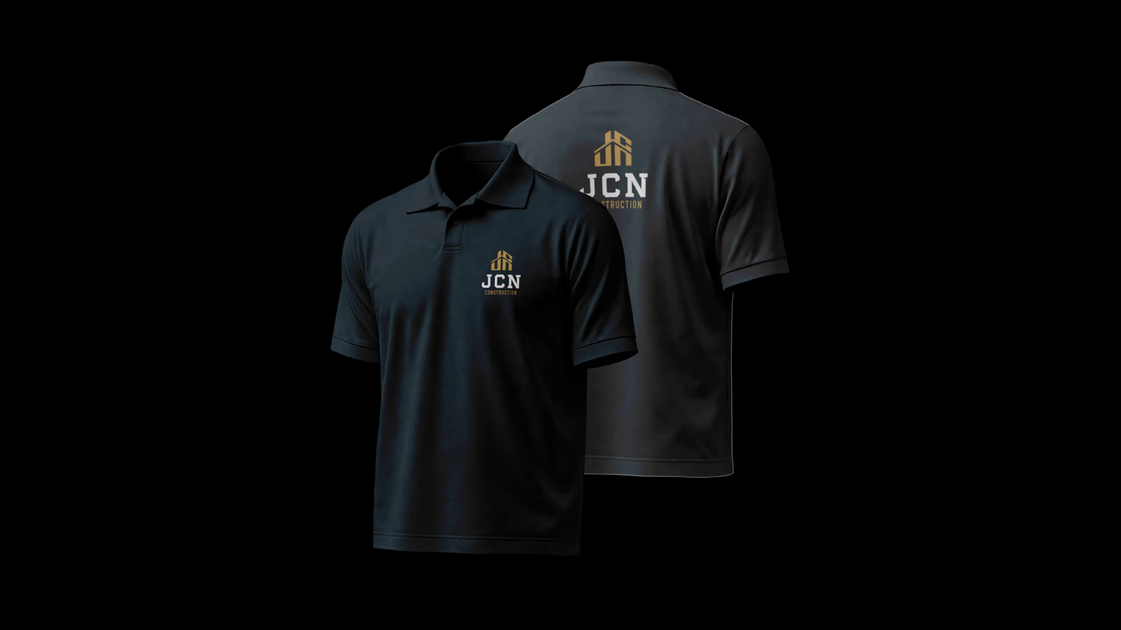
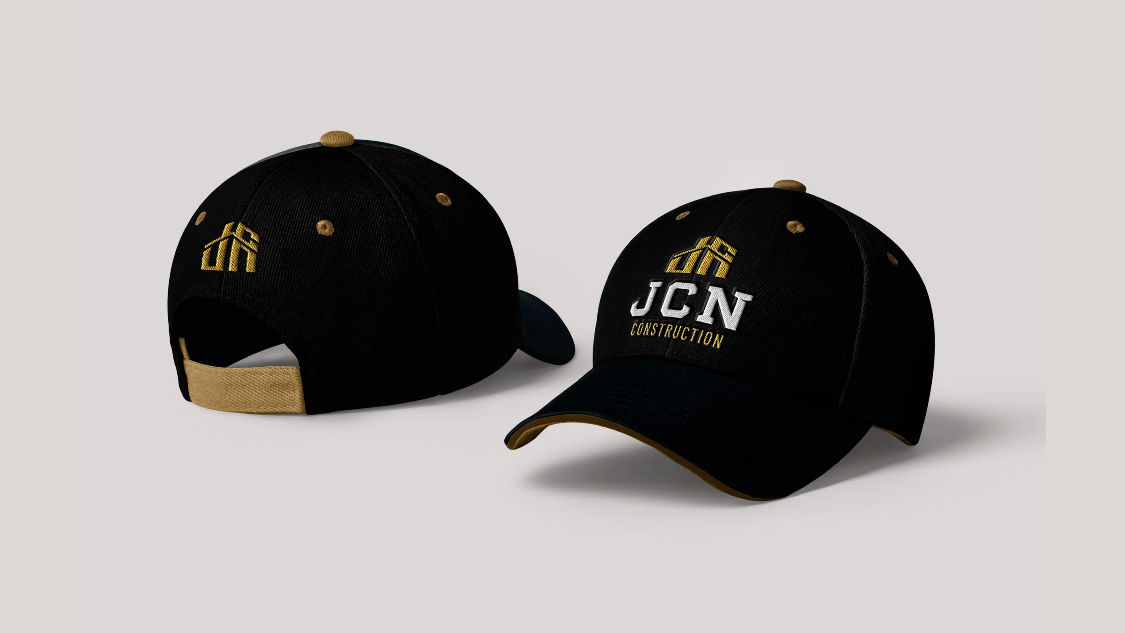
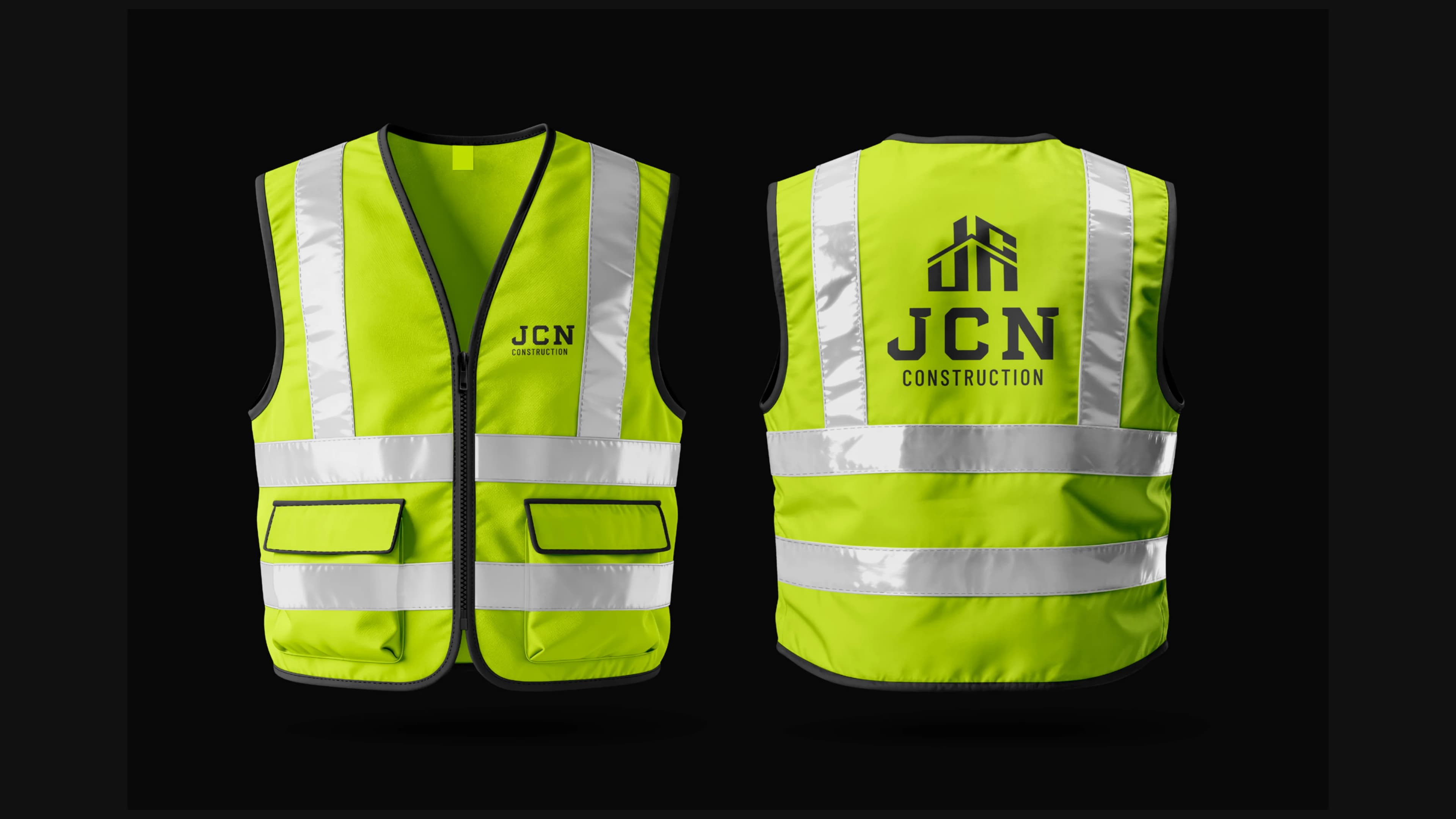
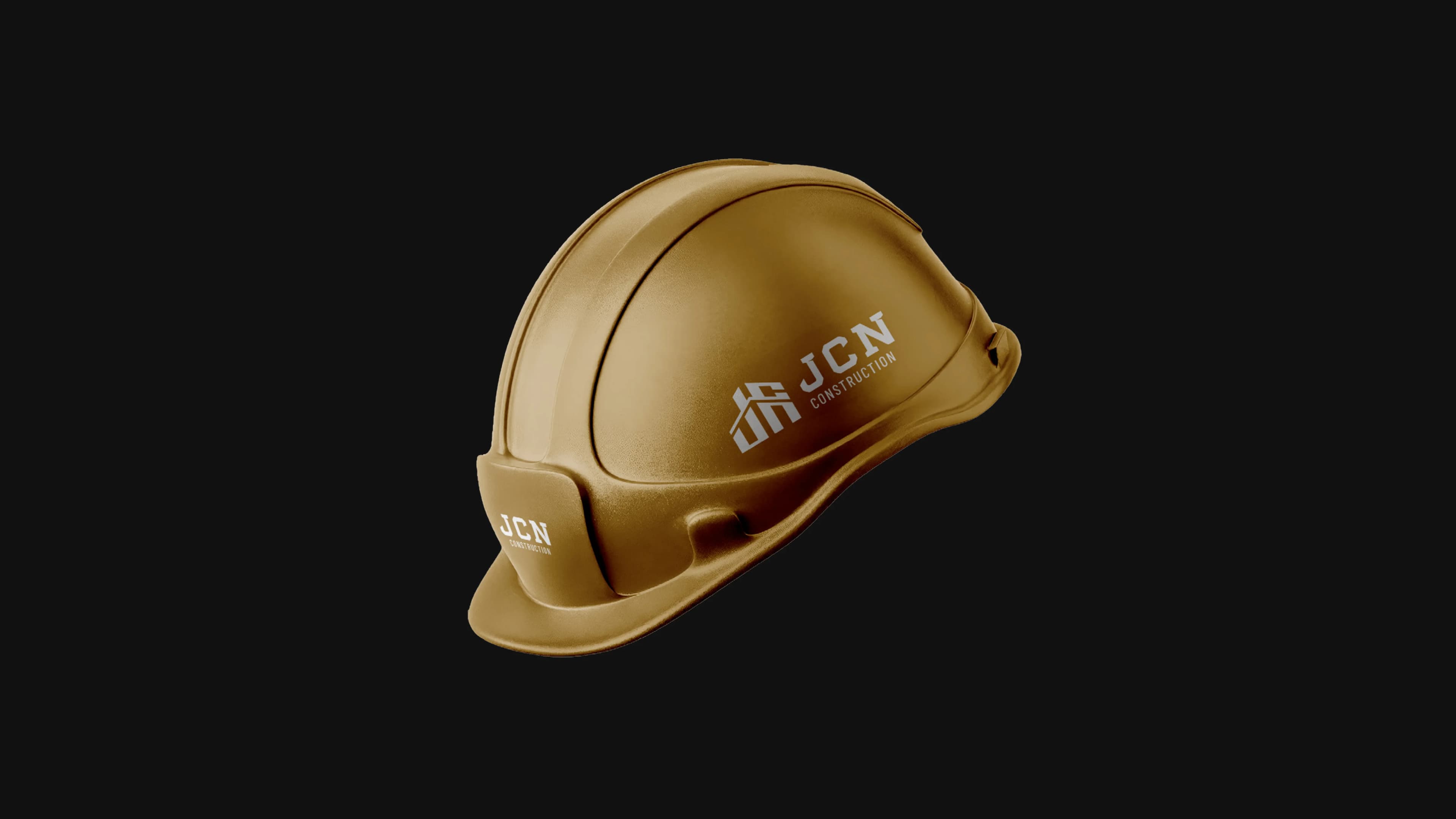
Brand Ecosystem in Use
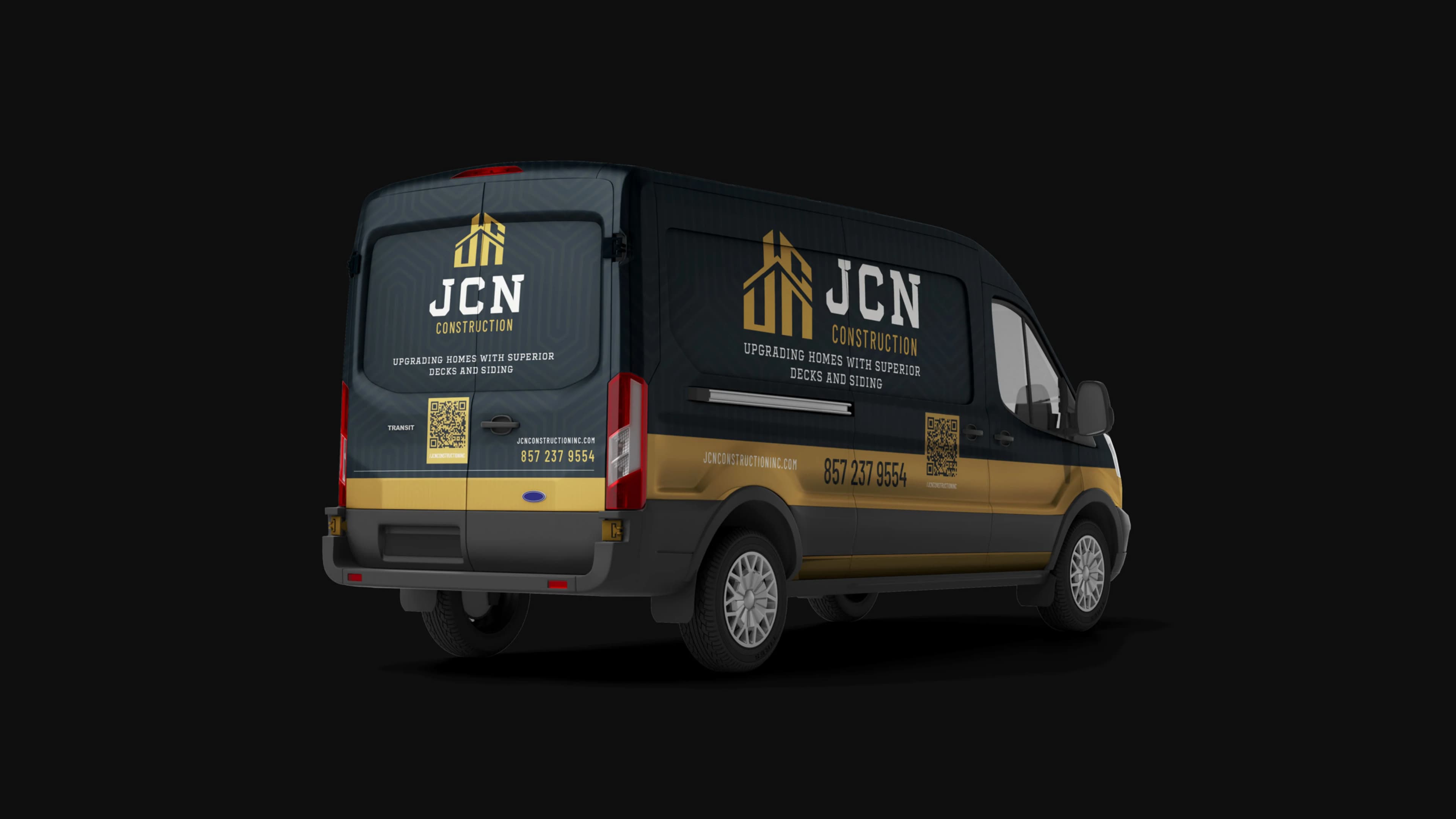
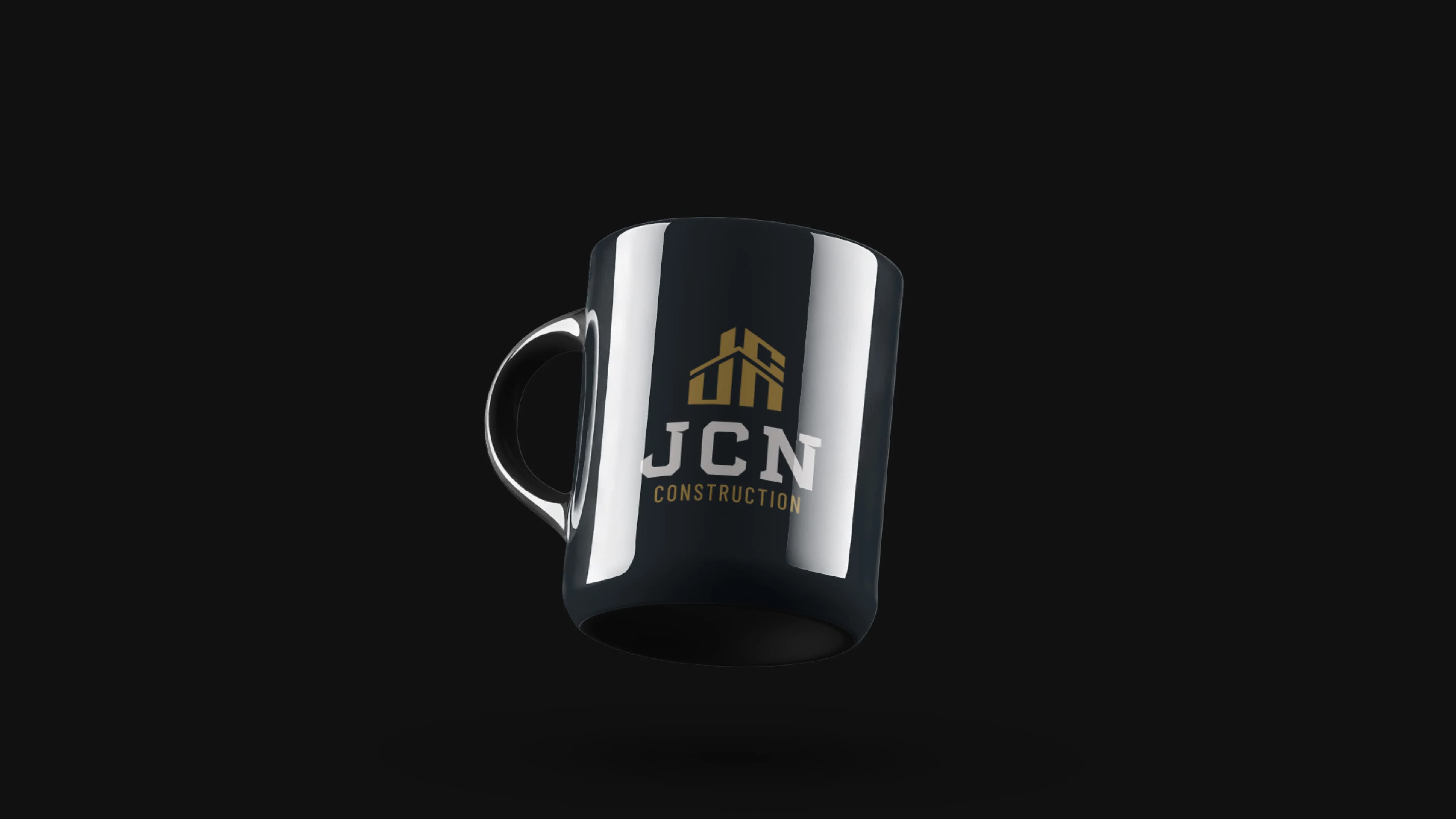
From digital touchpoints and custom website screens to social media content, vehicle wraps, site banners, and apparel, see how the identity comes alive in real-world applications.