Marketing & Branding Agency · Massachusetts
Direct Line:(508) 904-5989

VISUAL IDENTITY
STUDIOC
Lifetime
Throughout this presentation, we'll walk through everything that wasanalyzed, researched, and created to solve the challenges outlined for building the brand's visual universe.
Every strategic choice, from color psychology to typographic weight, was made with purpose and precision, ensuring Lifetime's identity communicates exactly what its audience needs to feel: trust, elegance, and uncompromising quality.
Every strategic choice, from color psychology to typographic weight, was made with purpose and precision, ensuring Lifetime's identity communicates exactly what its audience needs to feel: trust, elegance, and uncompromising quality.
Visual Identity Project
01 — Symbol Construction
The Mark Concept
The brand symbol combines strategic visual geometry with core brand attributes to create an iconic, memorable emblem.
02 — Logo System
Official Variants
A flexible logo system with primary and secondary lockups designed for seamless performance across digital screens and physical print.
 Primary Lockup
 Secondary HorizontalPrimary Brand Background
 Dark Background Variant
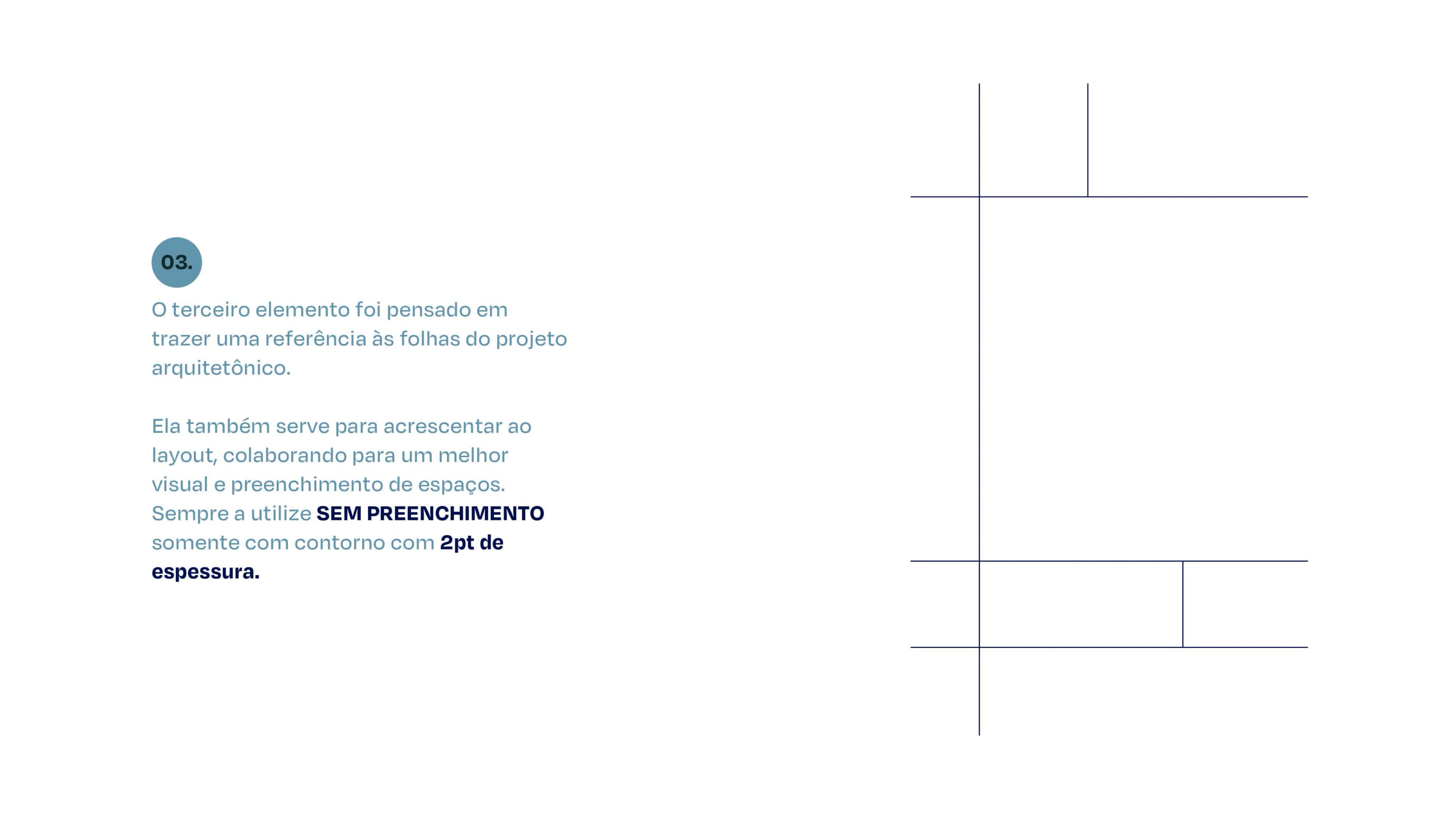
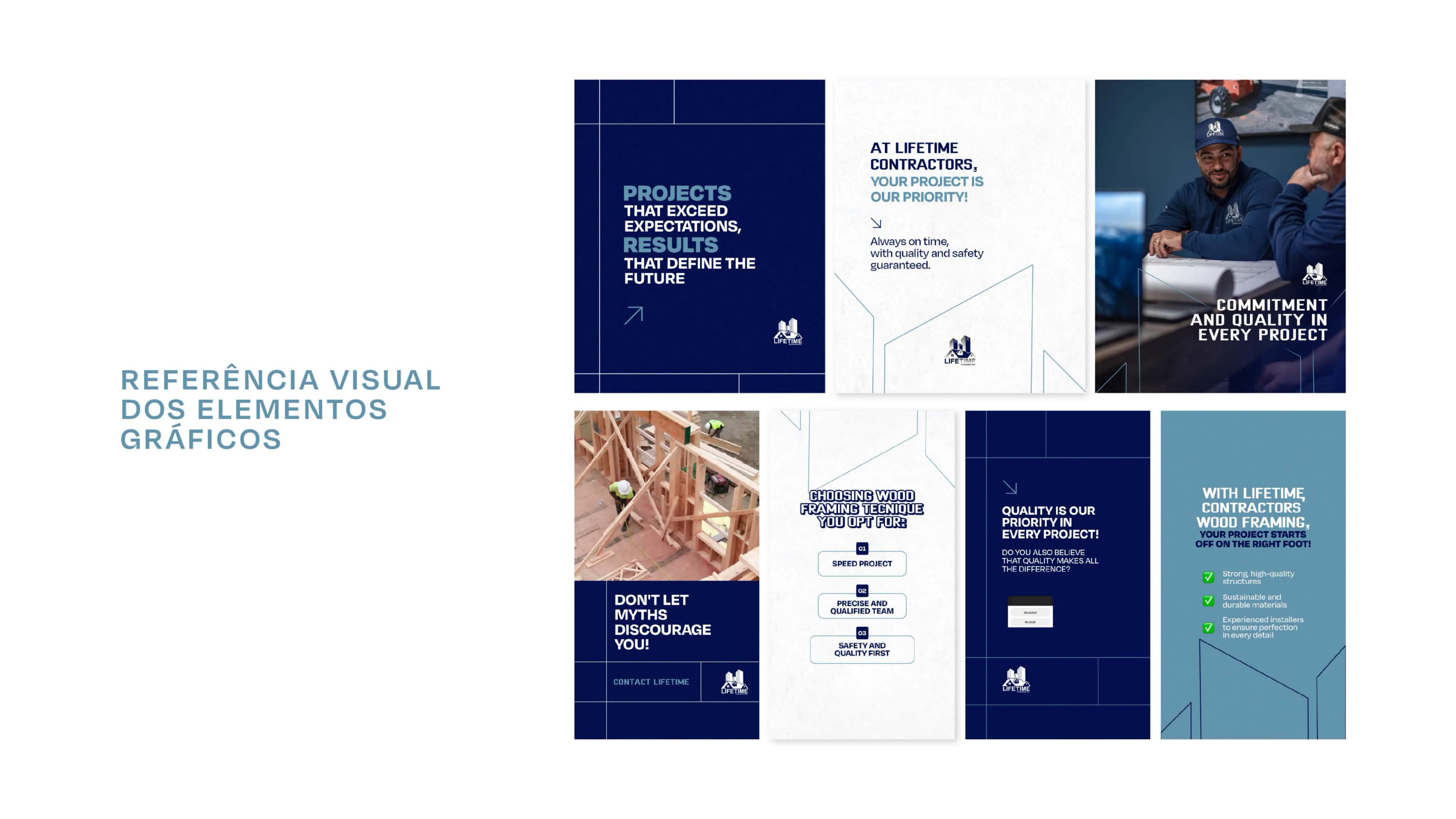
03 — Graphic Elements
Brand Pattern & Textures
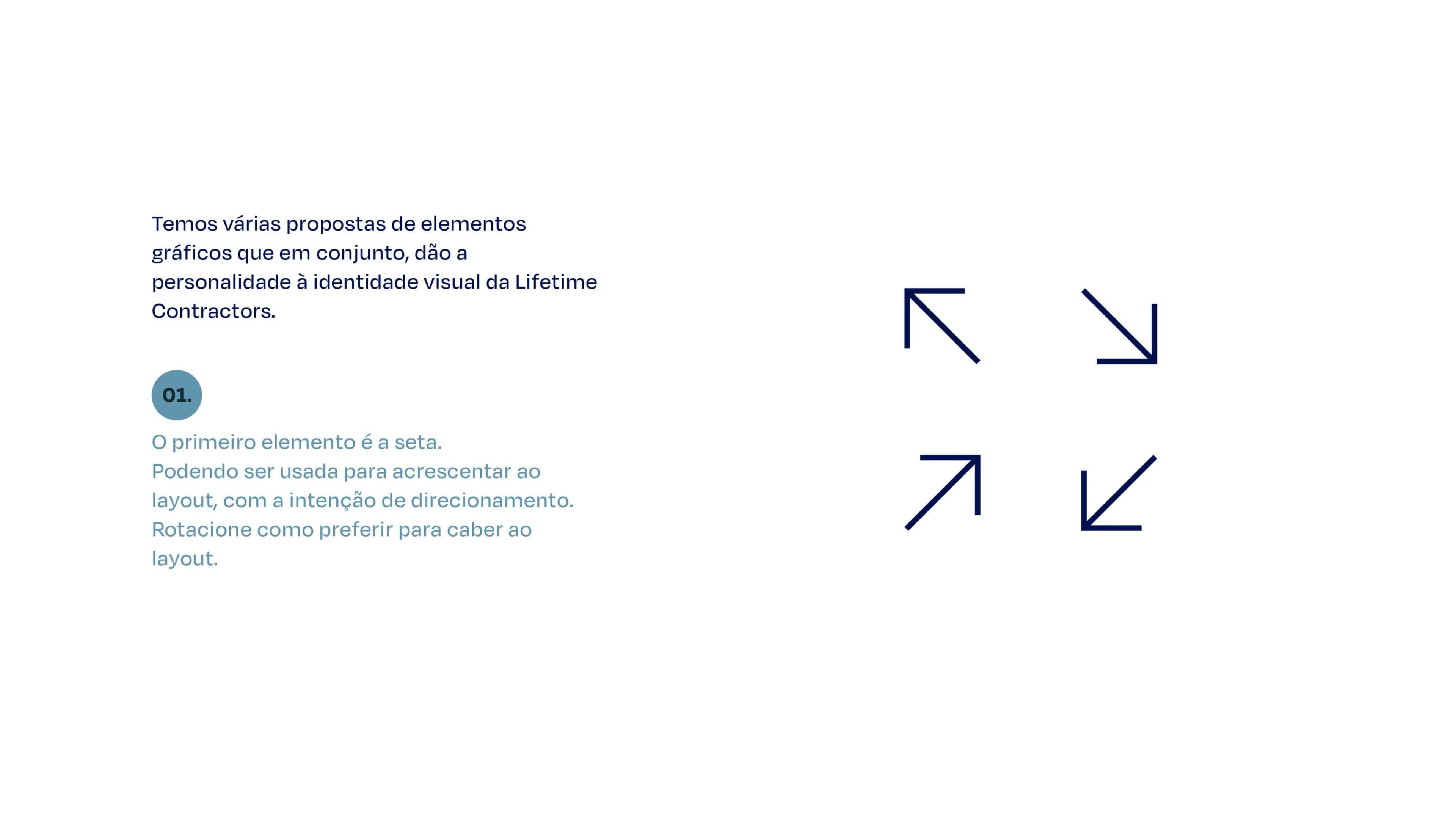
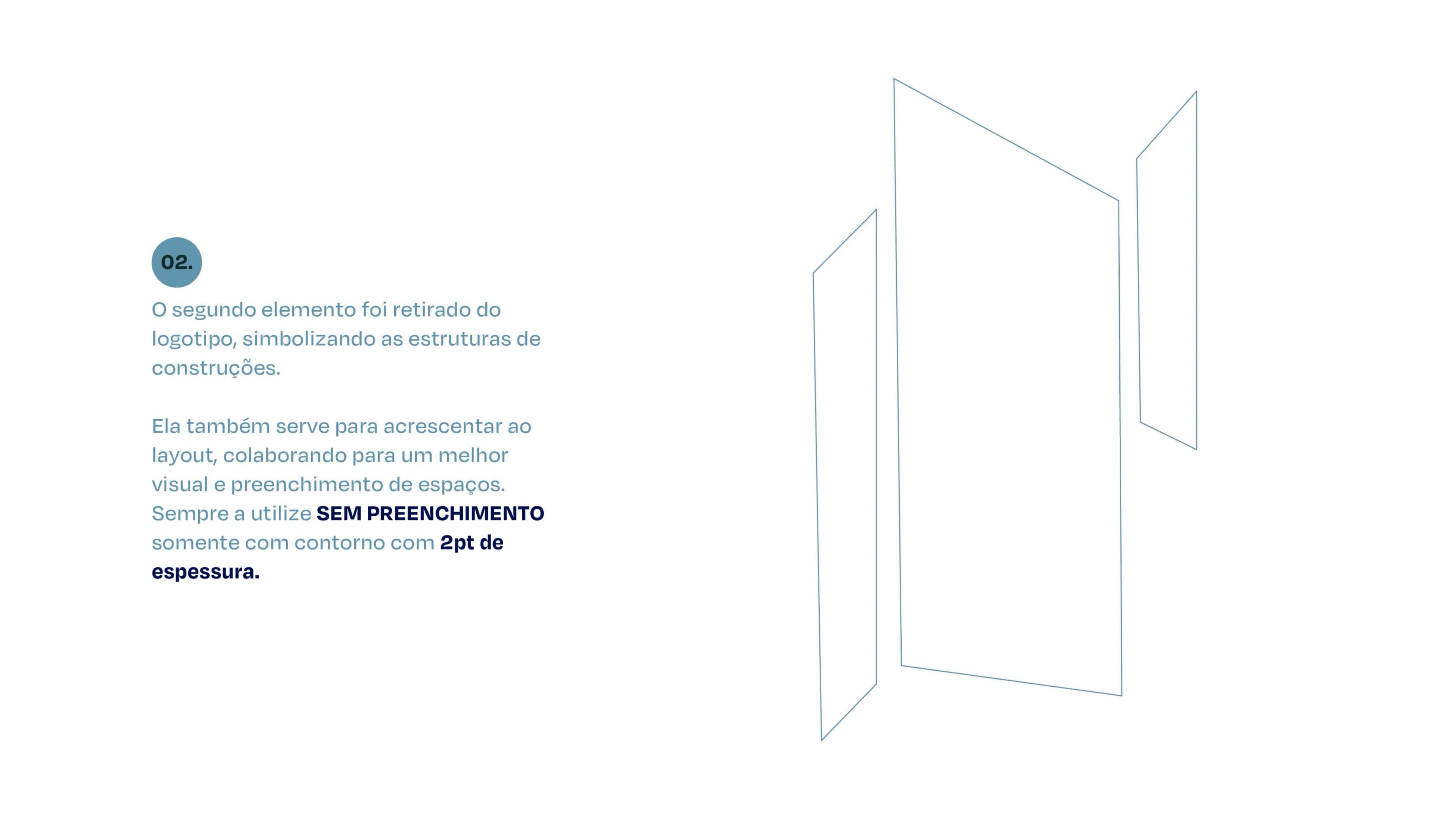
Proprietary graphic patterns created from the logo mark to form cohesive brand accents across collateral and signage.
04 — Color Palette
Brand Colors
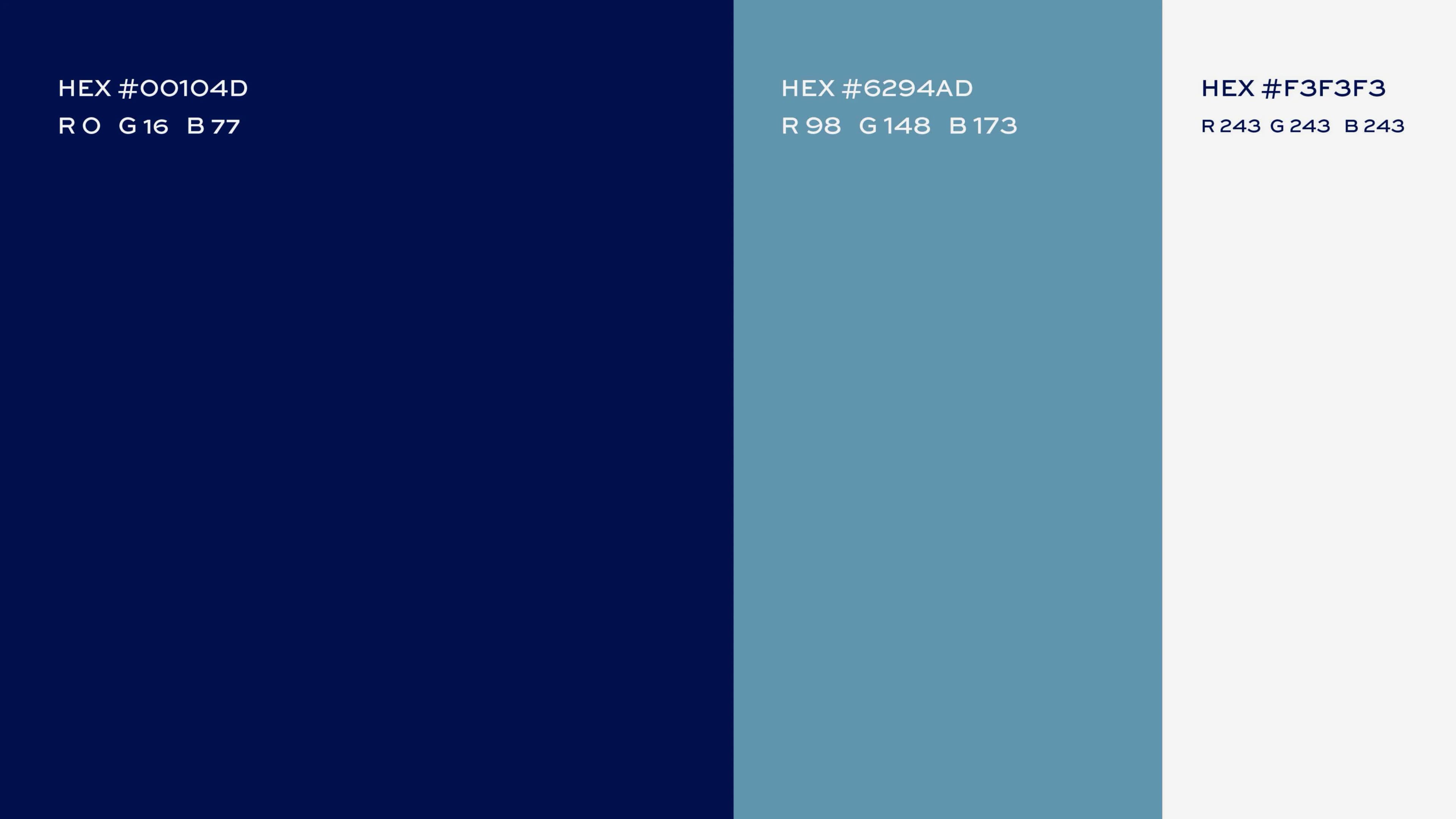
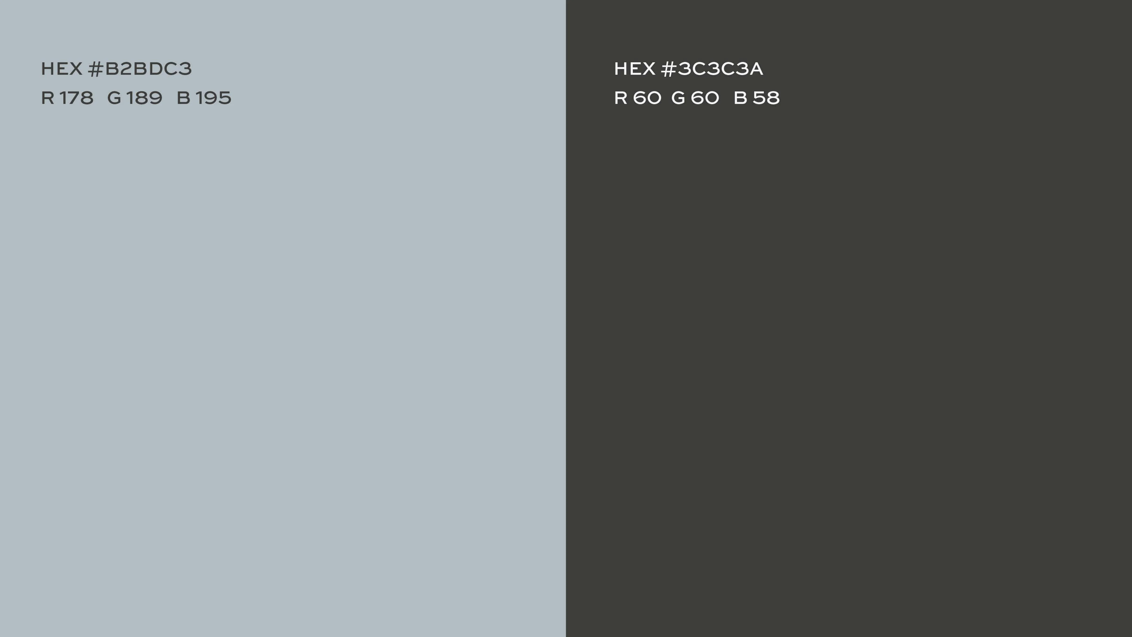
Curated color palette designed to express authority, premium quality, and distinction.
Lifetime Cyan
#00B4D8
Carbon Obsidian
#121212
Deep Sky Blue
#0077B6
Ice White
#EDF6F9
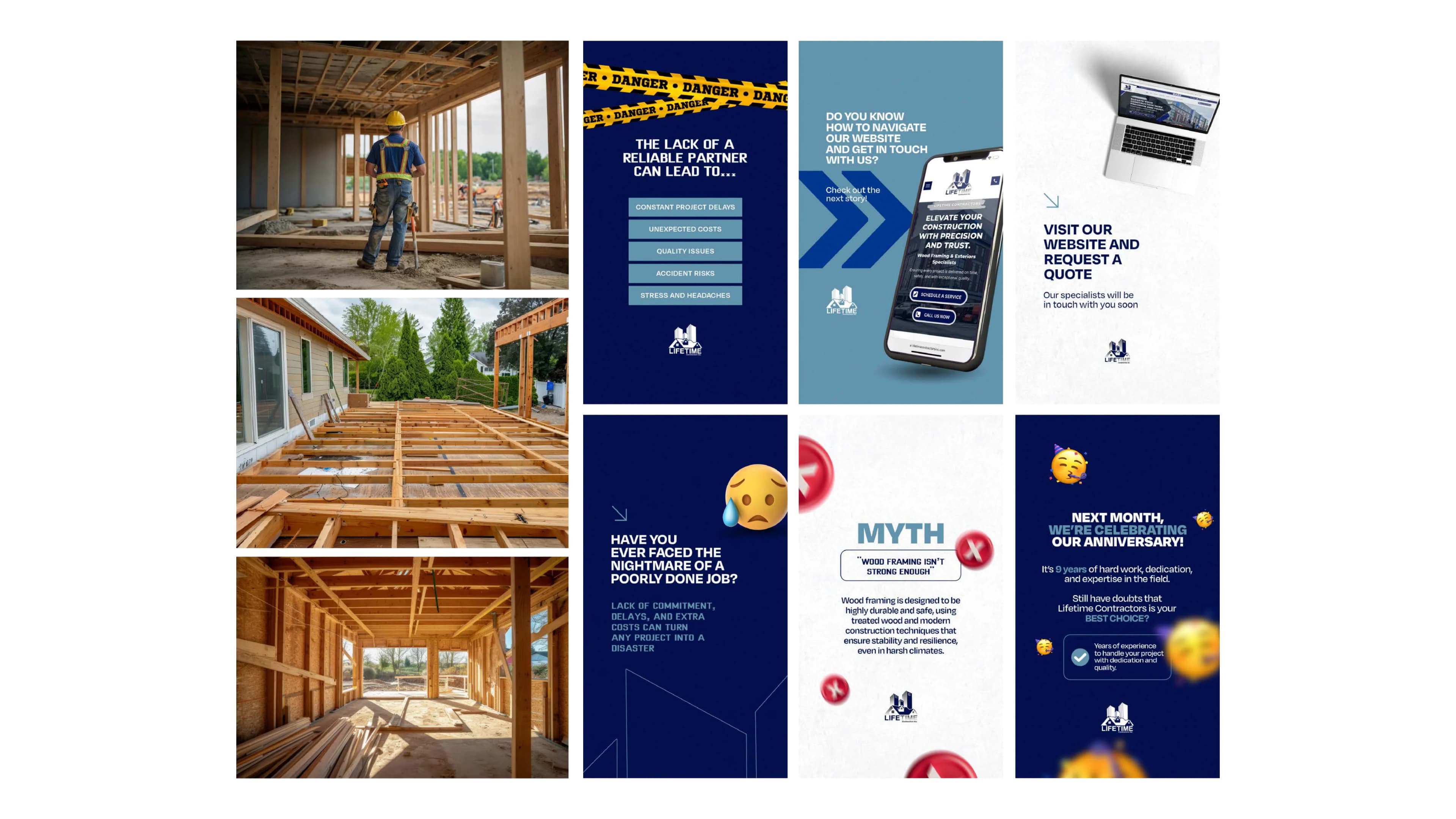
05 — Brand Applications
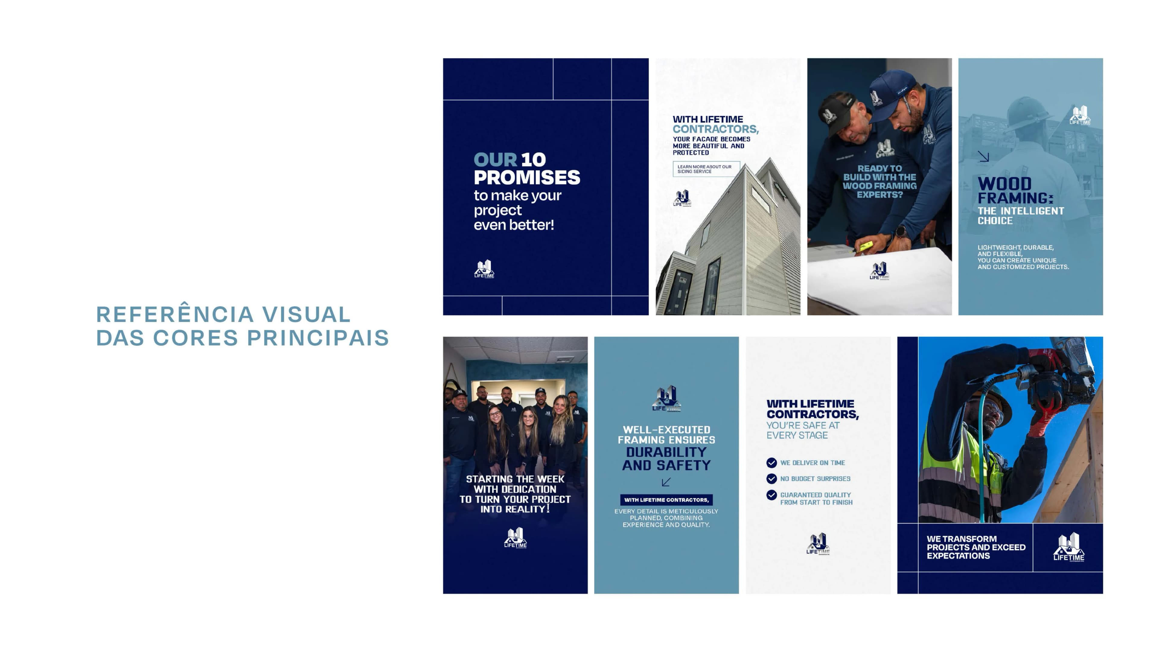
Brand in Use
From digital touchpoints to physical apparel, signage, and collateral, see how the identity comes alive in real-world applications.
Studio /// C Strategy & Branding
Ready to Transform Your Brand?
Let's build a powerful, market-leading visual identity for your business.
Start Your Project →