
VISUAL IDENTITY
Los Cabos Mexican Grill
Every strategic choice, from color psychology to typographic weight, was made with purpose and precision, ensuring Los Cabos Mexican Grill's identity communicates exactly what its audience needs to feel: trust, elegance, and uncompromising quality.
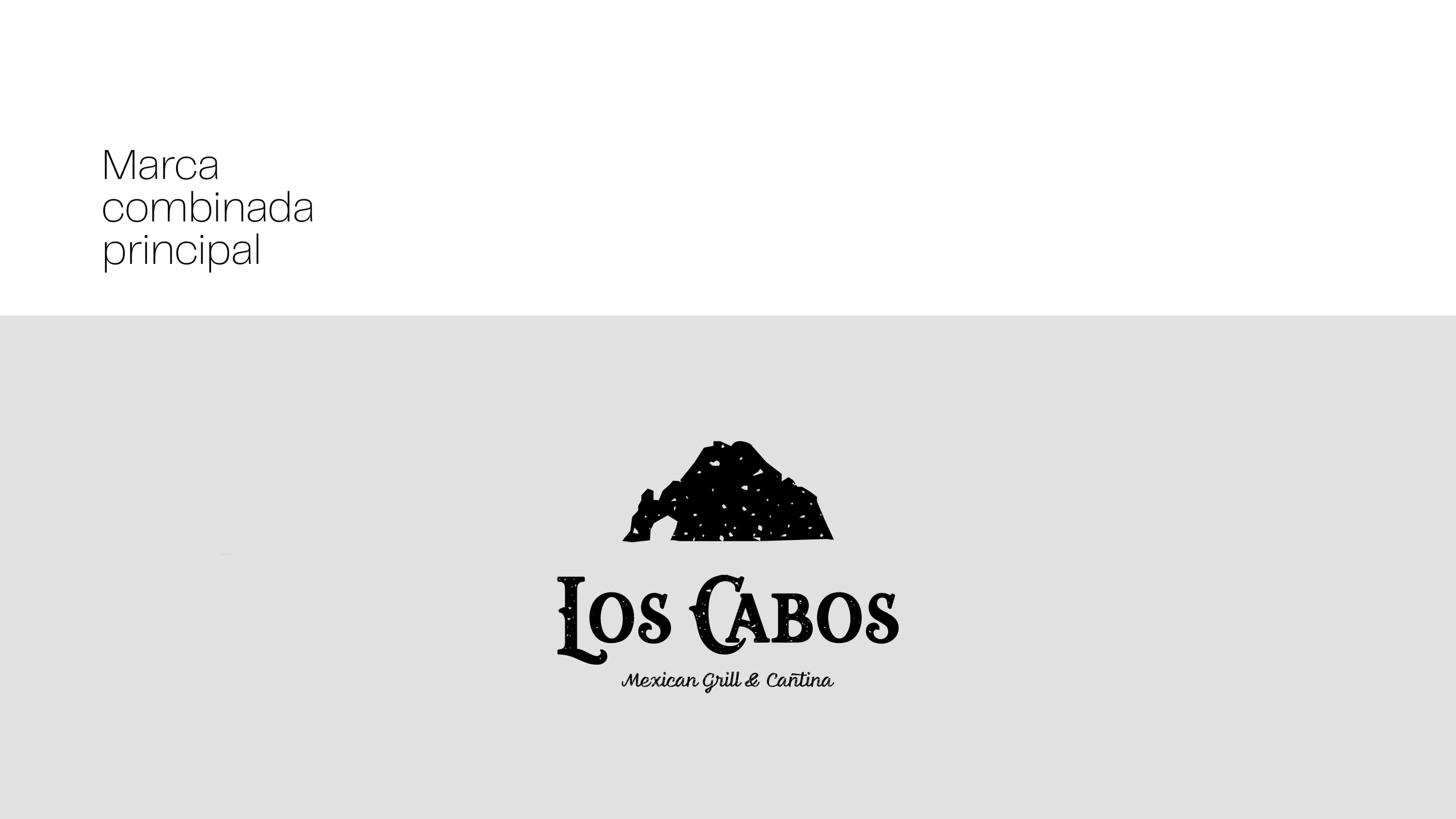
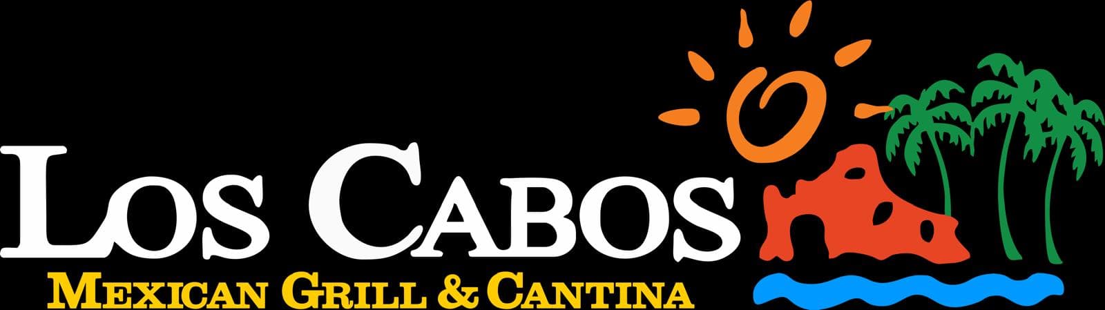
Logo Redesign (Before & After)
Comparing the previous logo mark with the new visual identity highlights the strategic evolution toward a cleaner, more modern, and visually compelling brand presence.
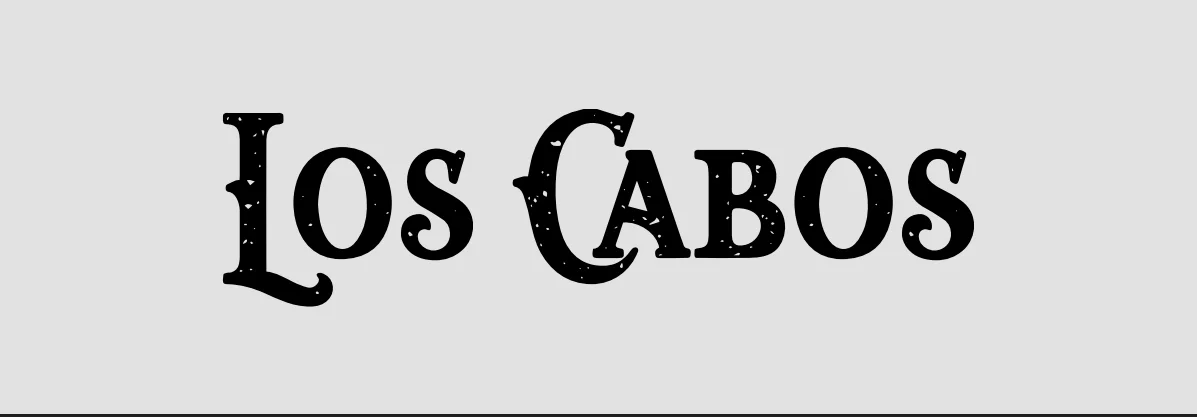
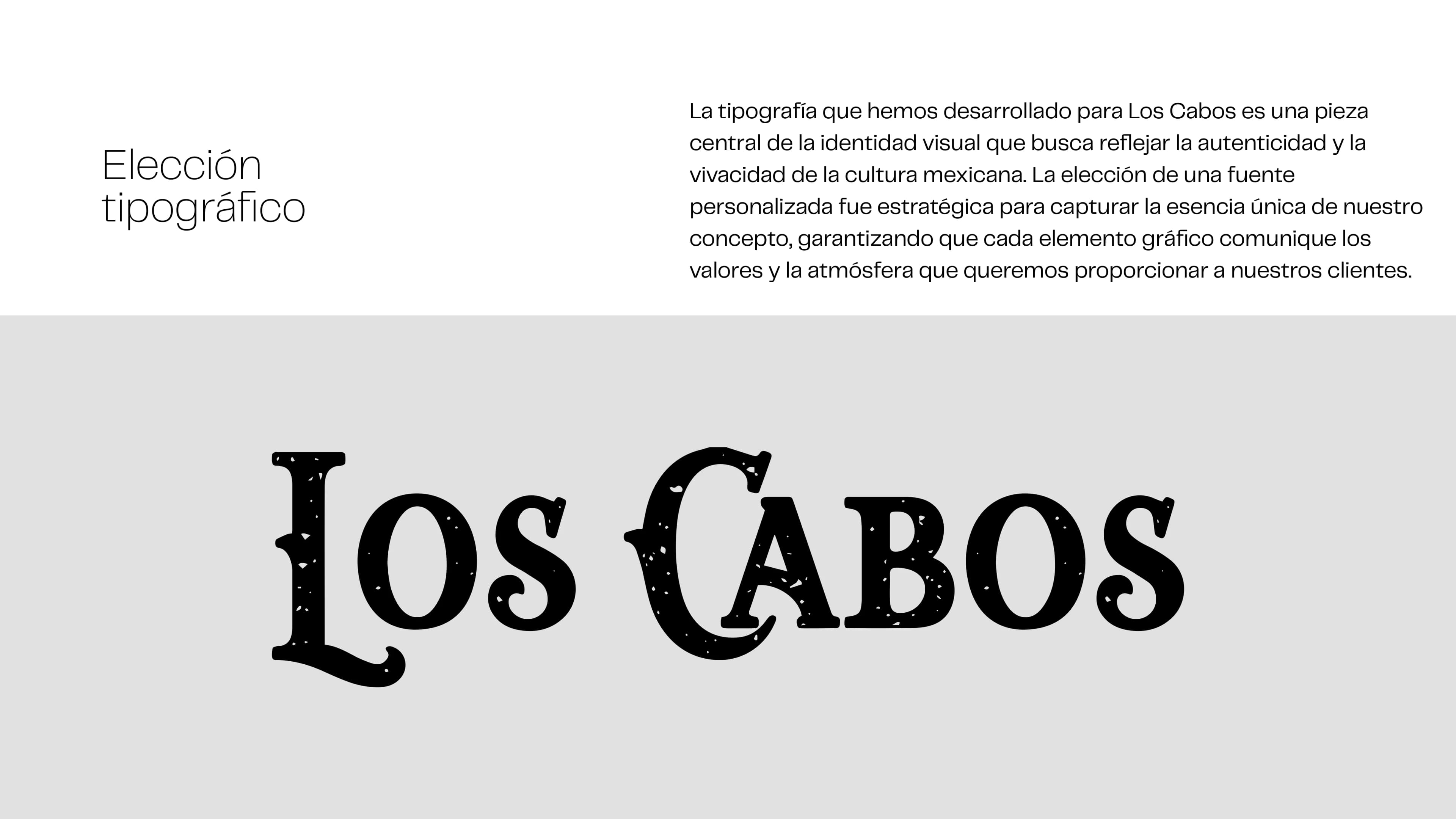
Typography Selection
The typography we developed for Los Cabos is a central piece of the visual identity, designed to reflect the authenticity and vibrancy of Mexican culture. Choosing a custom typeface was strategic to capturing the unique essence of our concept, ensuring that every visual element communicates the values and atmosphere we deliver to our guests.
Symbol Concept & Symbolism
For the construction of the symbol, we explored the story behind the name Los Cabos and referenced the iconic landmark "El Arco" (The Arch), which is already part of the current logo. It is a famous monument known worldwide as a tourist landmark and for its stunning sunsets. At certain times of the year, it is even possible to walk underneath it when the tide is low.
 01. El Arco Inspiration
 04. Final Symbol Emblem
The arch was used as a central element in the construction of the symbol, ensuring a cleaner, more direct form with greater visual impact.
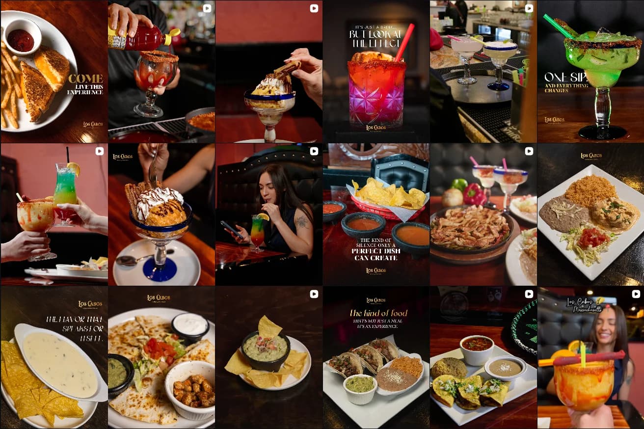
Brand content & audience engagement
A targeted Instagram content and video strategy engineered to showcase culinary artistry, vibrant atmosphere, and build immediate market authority.
Palette of primary colors
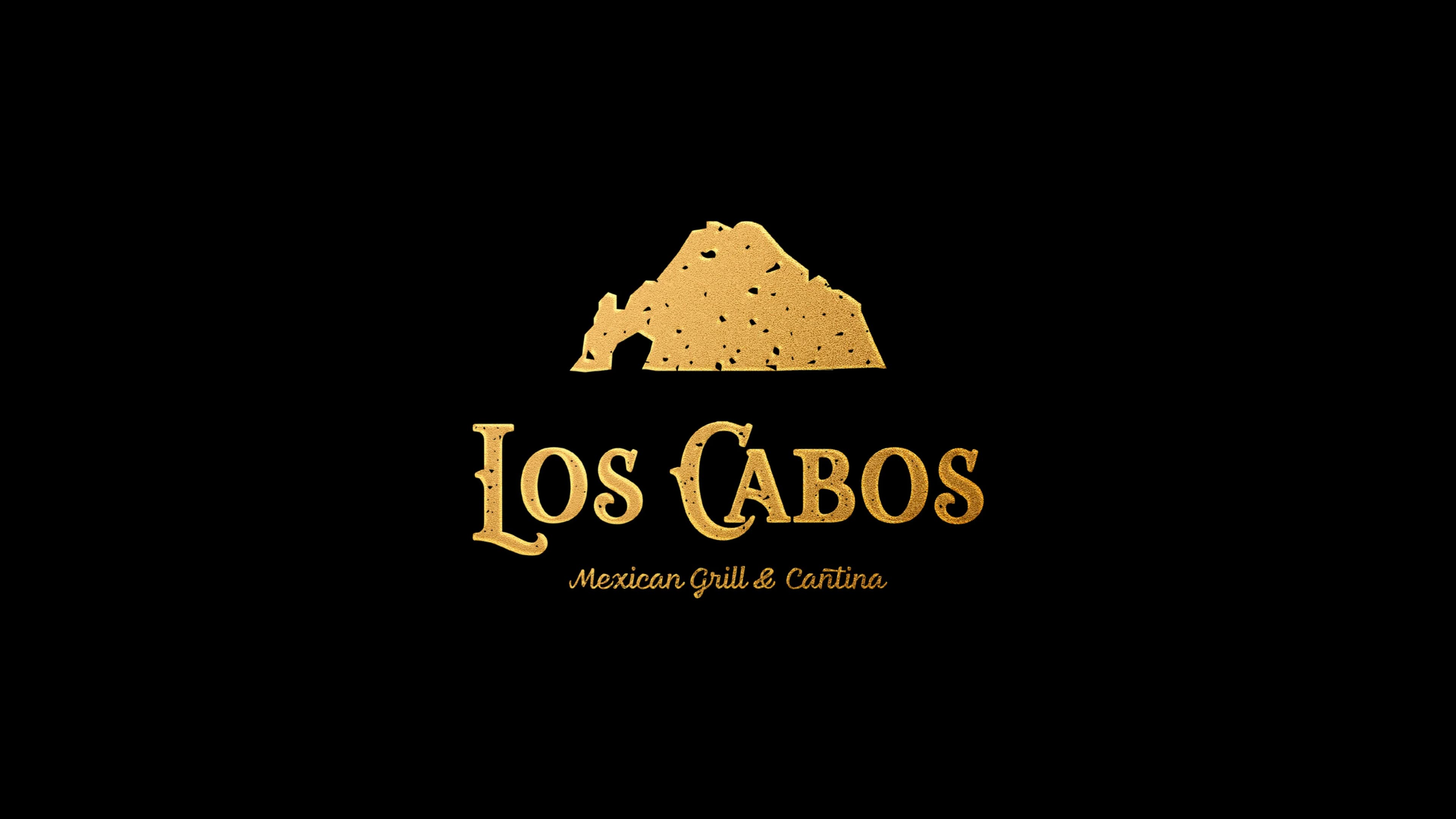
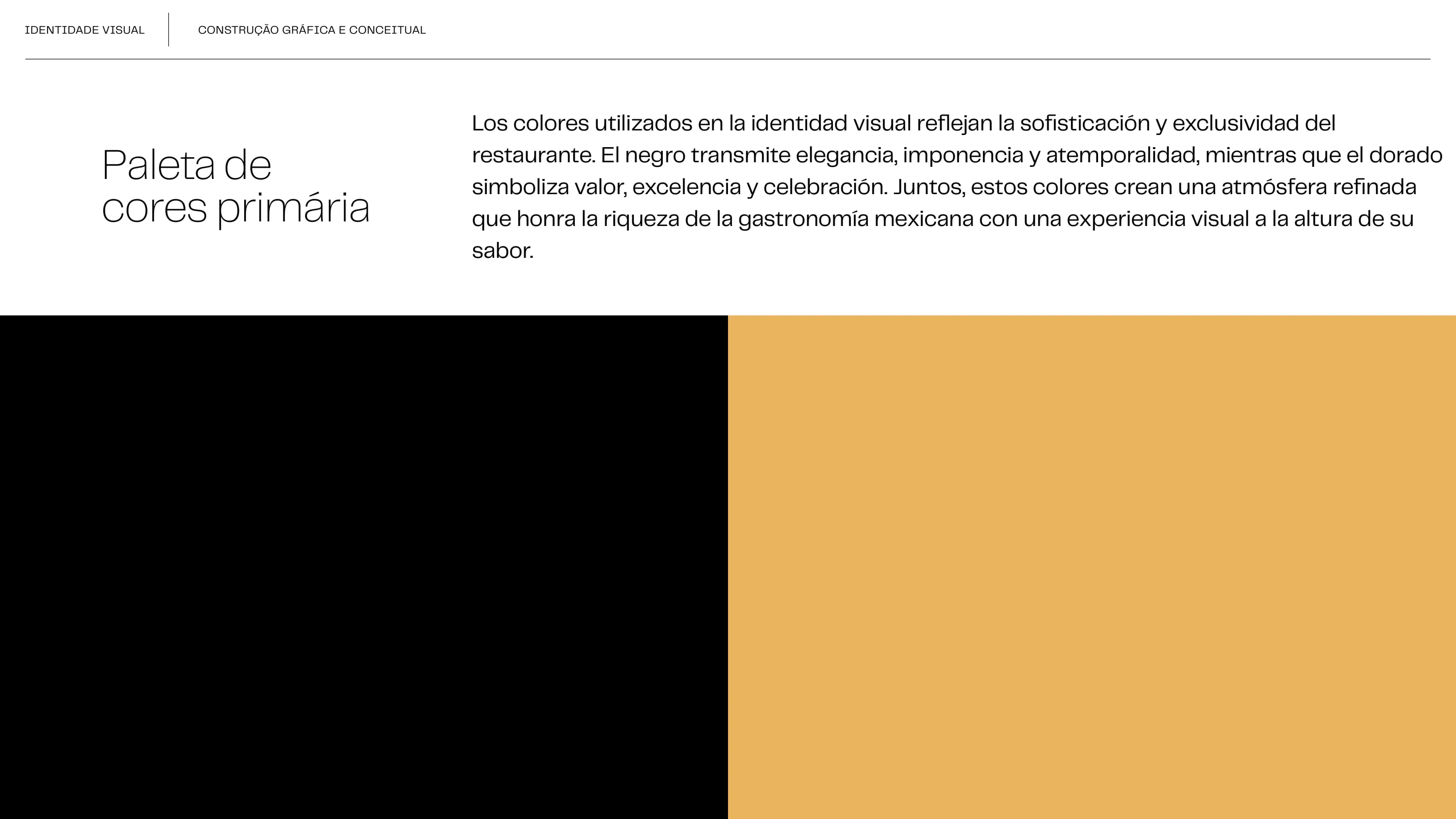
The colors used in the visual identity reflect the sophistication and exclusivity of the restaurant. Black conveys elegance, presence, and timelessness, while gold symbolizes value, excellence, and celebration. Together, these colors create a refined atmosphere that honors the richness of Mexican gastronomy with a visual experience to match its flavor.
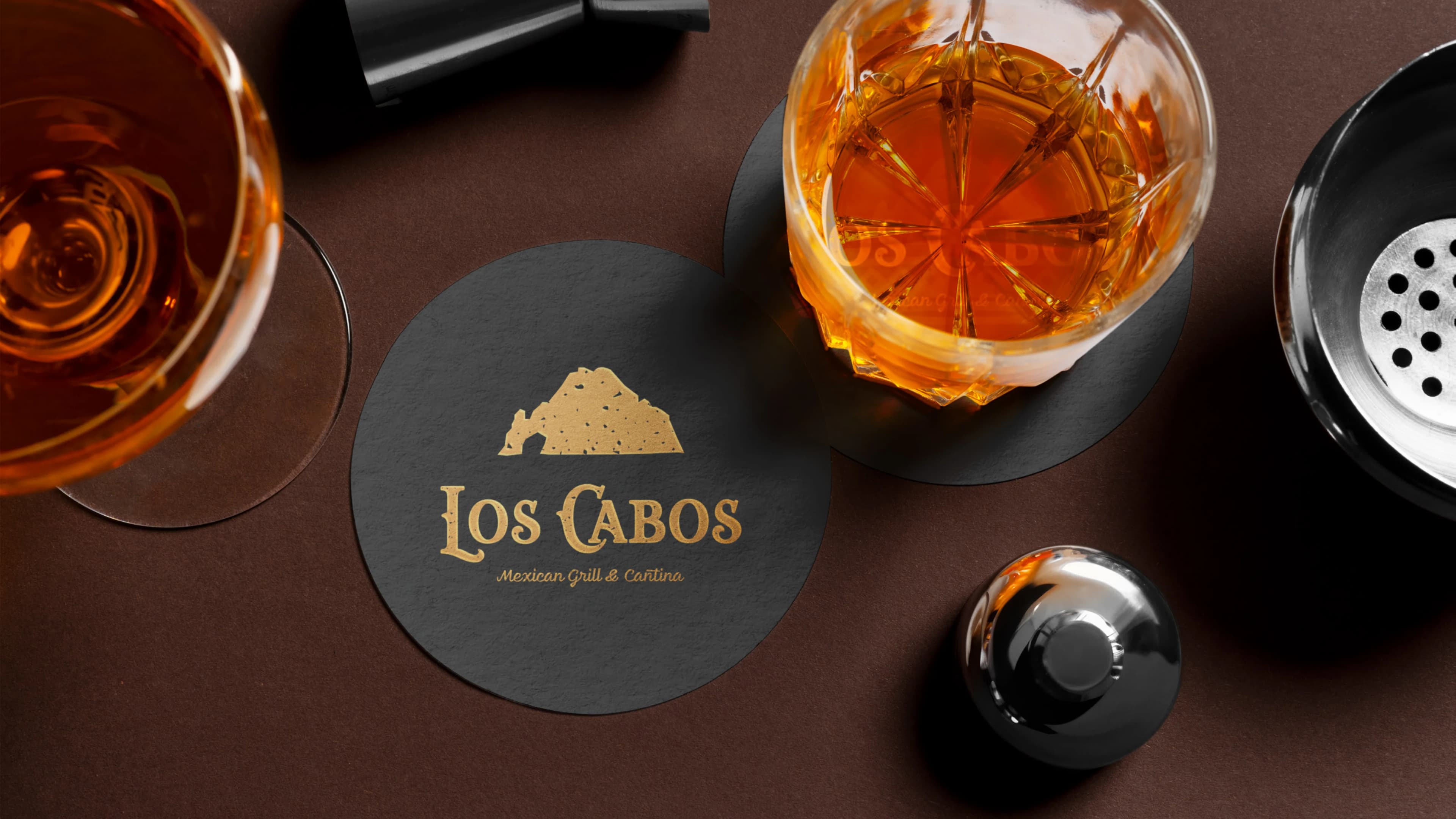
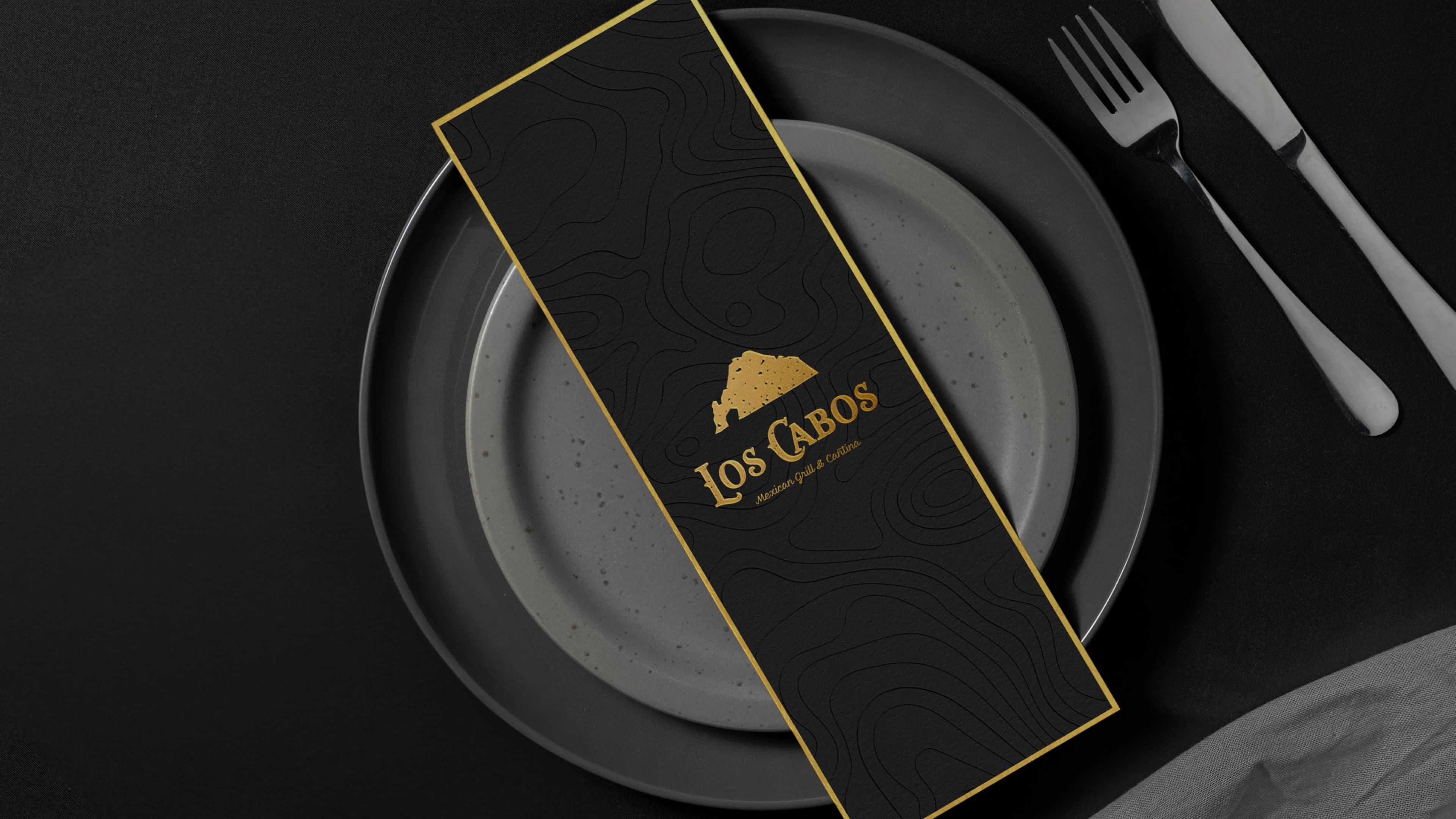
Seeing how the brand and its graphic universe perform in real-world application is essential to validating its effectiveness with its target audience, objectives, and touchpoints.
Ready to Transform Your Brand?
Let's build a powerful, market-leading visual identity, website, and social media presence for your business.