360° BRAND CASE STUDY
Strong Hands
Every strategic choice, from color psychology to typographic weight, was made with purpose and precision, ensuring Strong Hands's identity communicates exactly what its audience needs to feel: trust, elegance, and uncompromising quality.
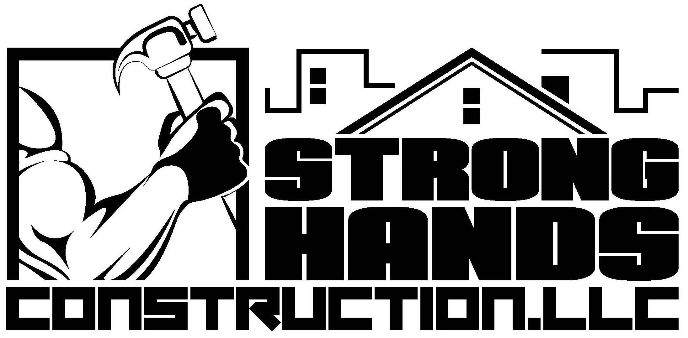
Brand Logo Before & After
Comparison between the original legacy logo and the new modern, high-precision visual identity engineered by Studio C for Strong Hands.
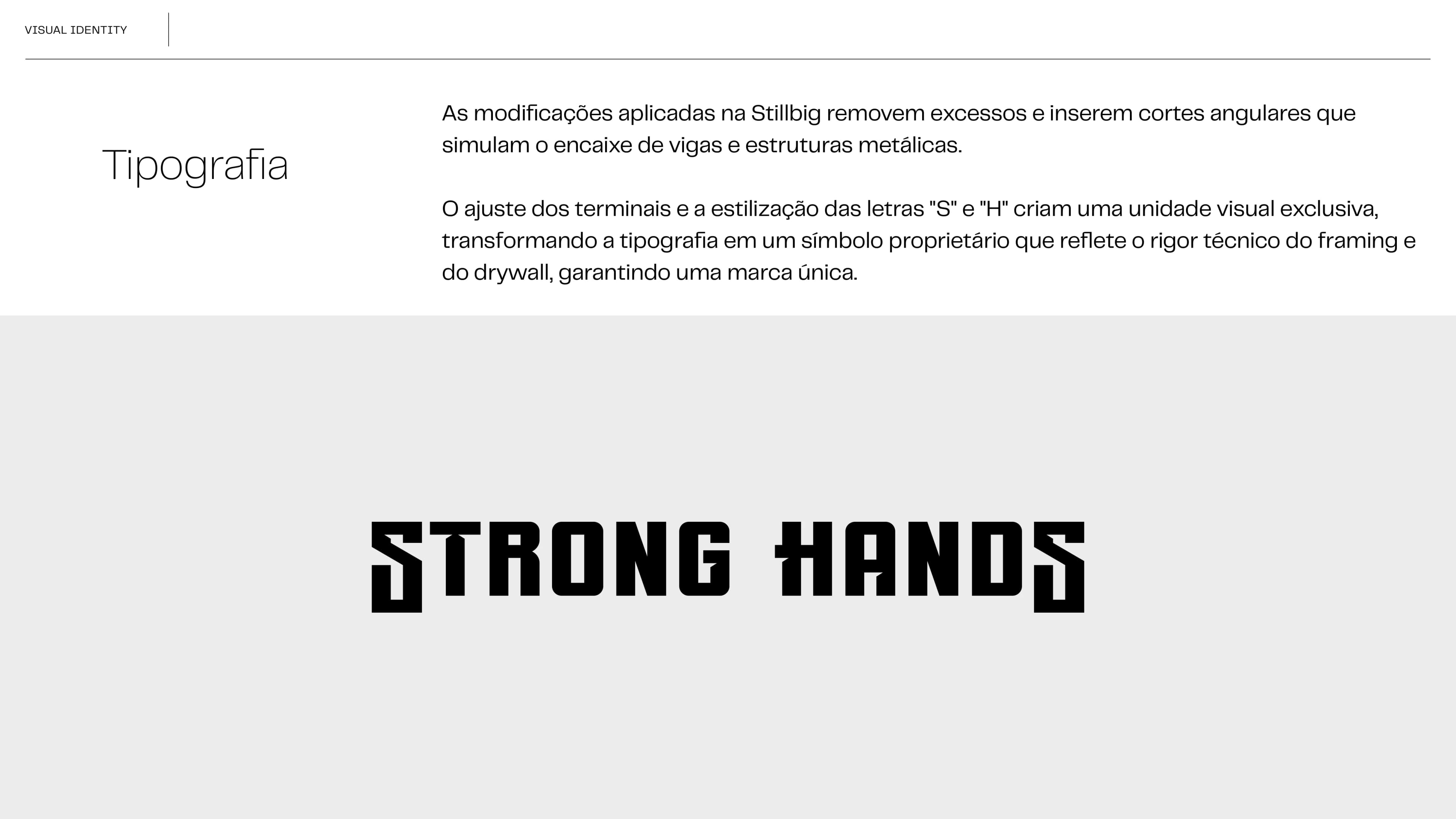
Brand Typography & Stillbig
Stillbig was selected for its robust stroke aesthetics and striking architecture, establishing a visual foundation of strength and structure for the brand.
This typographic choice communicates the technical precision required in the construction sector, ensuring a seamless reading experience that reflects attention to detail, craftsmanship, and safety in every Strong Hands project.
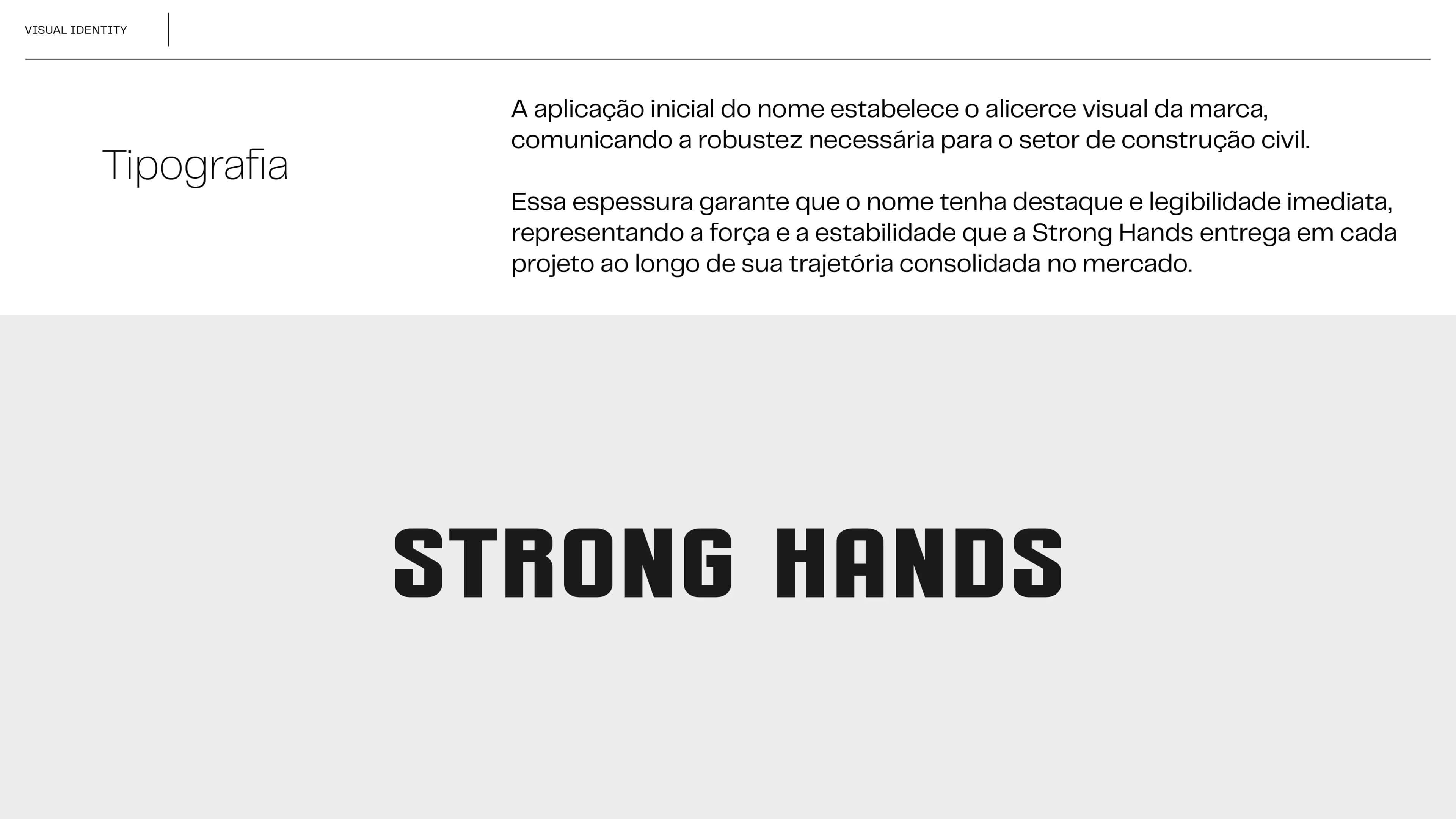
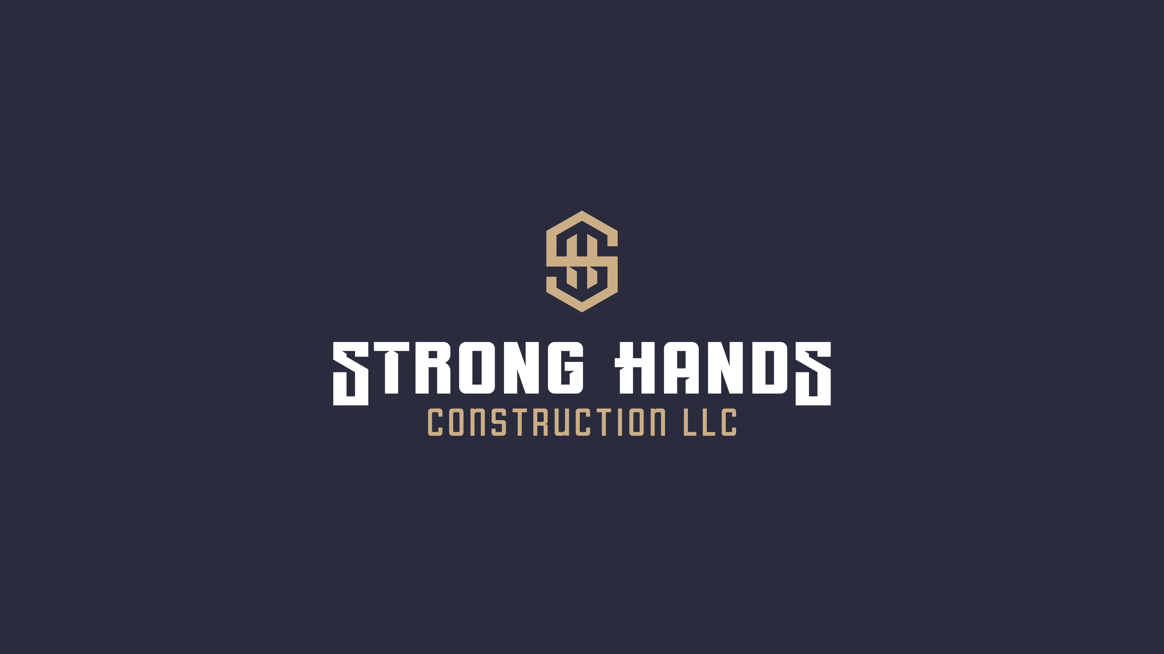
The initial application of the name establishes the visual foundation of the brand, communicating the necessary strength for the construction sector.

The adjustment of the terminals and the styling of the letters "S" and "H" create an exclusive visual unity, transforming the typography into a proprietary symbol that reflects the technical rigor of framing and drywall, guaranteeing a unique brand.
Official Brand Symbol
Strong Hands consolidates its two-decade trajectory through positioning that commands respect and corporate credibility. This phase of the presentation reveals the brand's maturity, showcasing it as a power capable of leading large-scale projects where technical rigor and organization are fundamental rules.
The concept of the symbol originates from the structural rigidity that defines the soul of construction. The SH monogram is formed by interlocking blocks, representing the precise assembly and solid structure of framing and drywall.
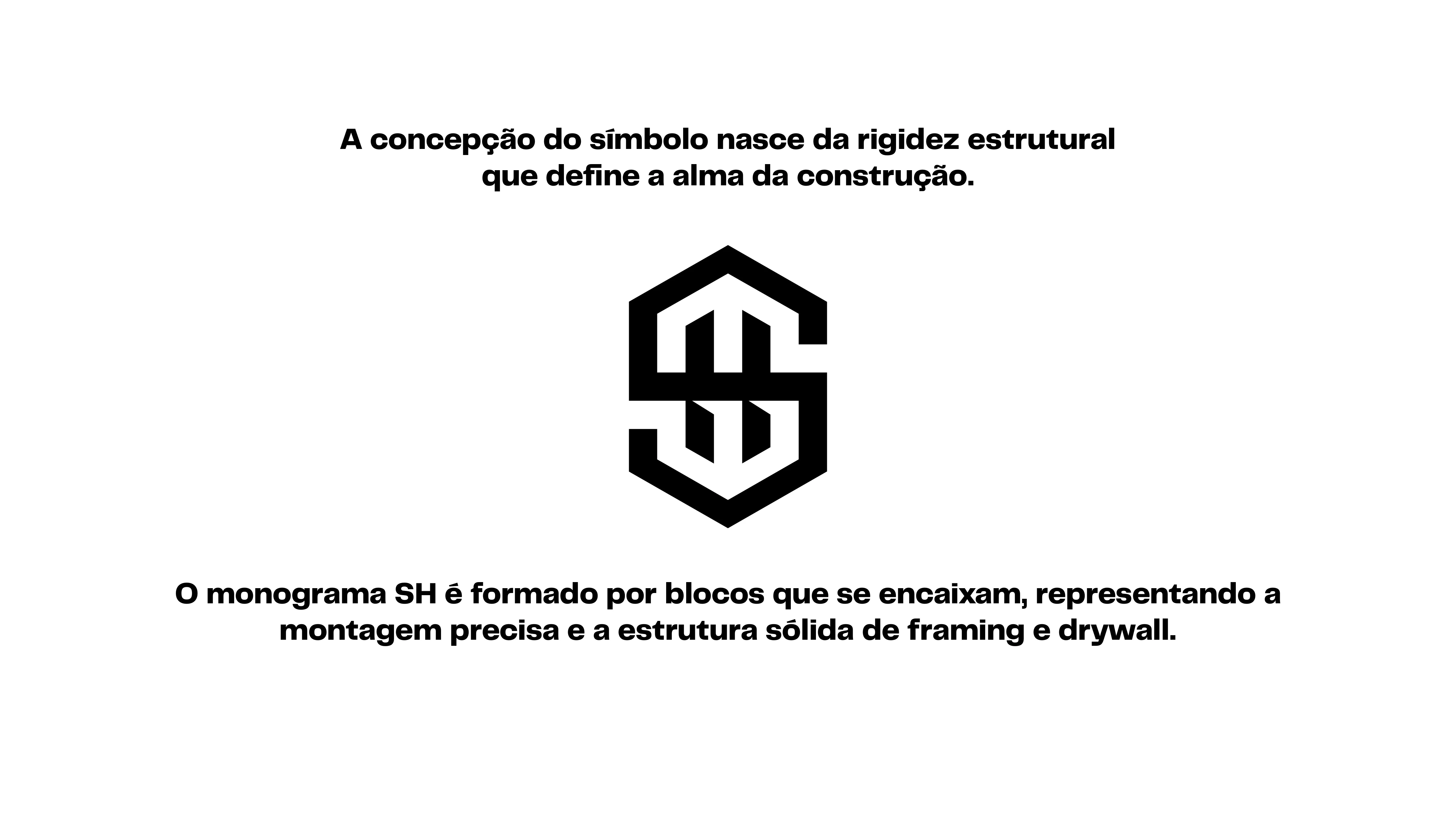
The right angles and cutouts were crafted to facilitate the legibility of the letters. These cuts create a shadow effect that adds dimension to the design, clearly indicating that the "S" precedes the "H", following the correct sequence of the name.
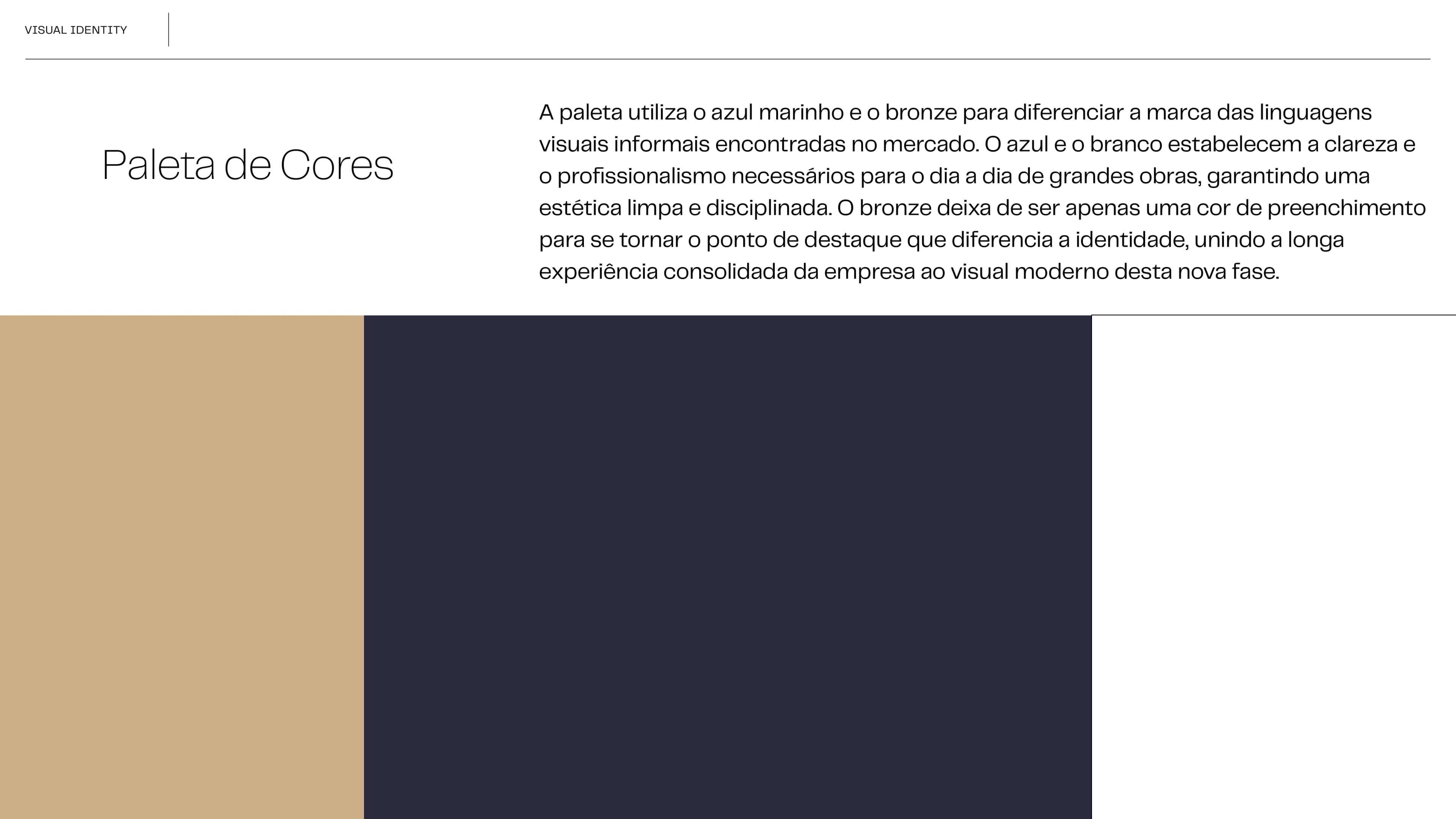
Brand Colors
The palette utilizes navy blue and bronze to differentiate the brand from informal visual languages found in the market. Blue and white establish the clarity and professionalism necessary for the daily operations of major construction projects, ensuring a clean and disciplined aesthetic. Bronze evolves from a mere accent color into a key highlight that sets the identity apart, connecting the company's long-consolidated experience with the modern visual language of this new phase.
Official Website
StudioC engineered a custom, high-converting digital platform for Strong Hands, Inc. to elevate their commercial framing, siding, and drywall presence across the New York region. Built for high-intent lead conversion, lightning-fast mobile performance, local SEO optimization, and direct client project inquiries.

Brand Content & Audience Engagement
A targeted Instagram content and video strategy engineered to showcase proof of craftsmanship, project transformations, and build immediate market authority for Strong Hands Construction.

Brand in Use
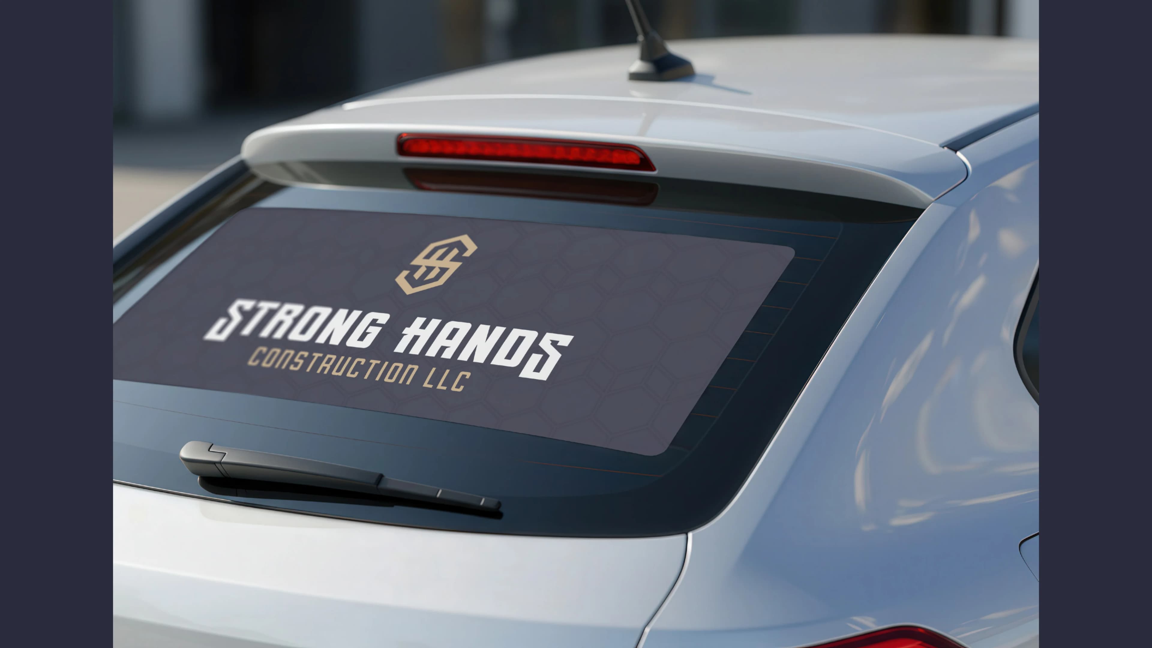
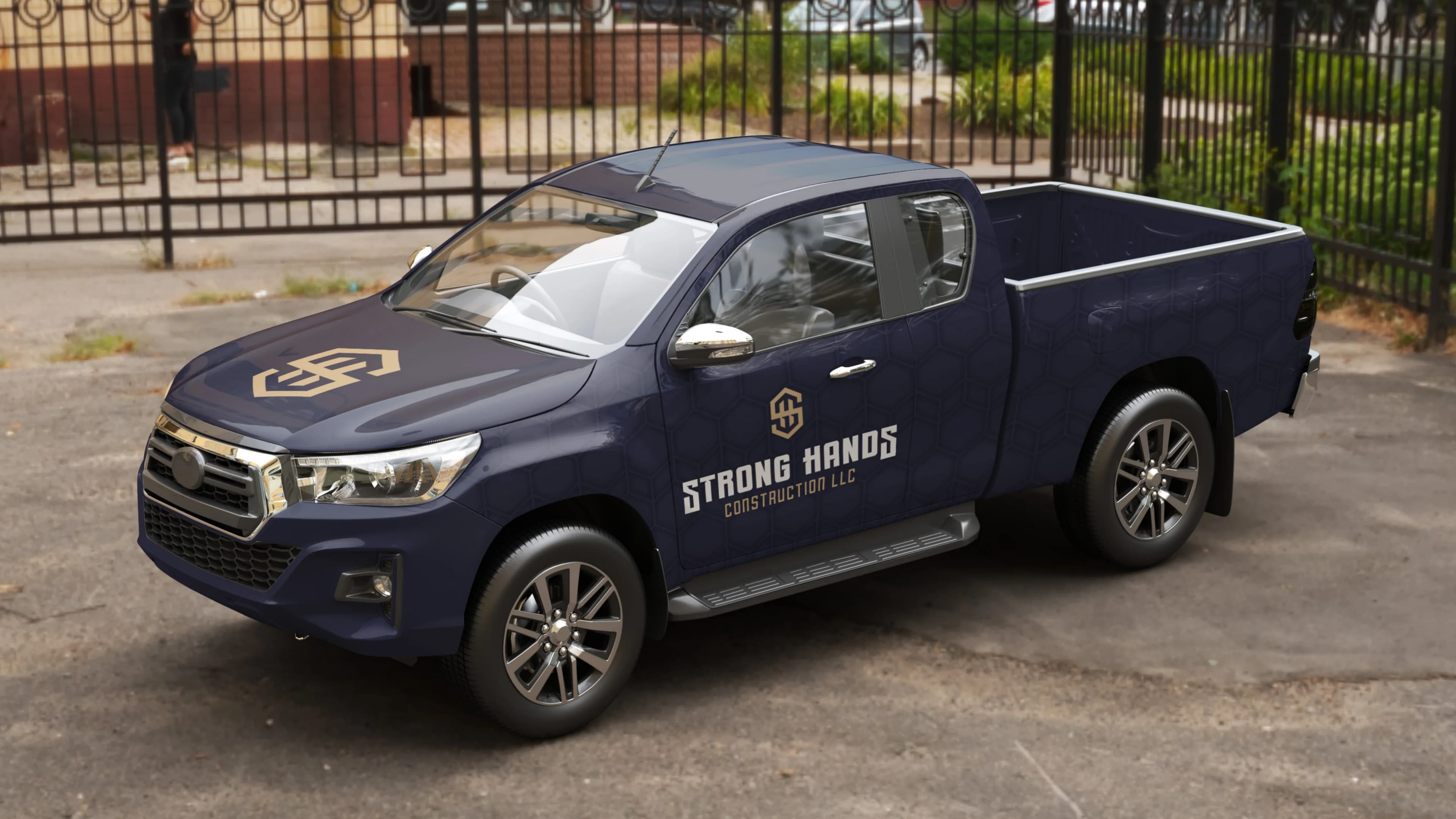
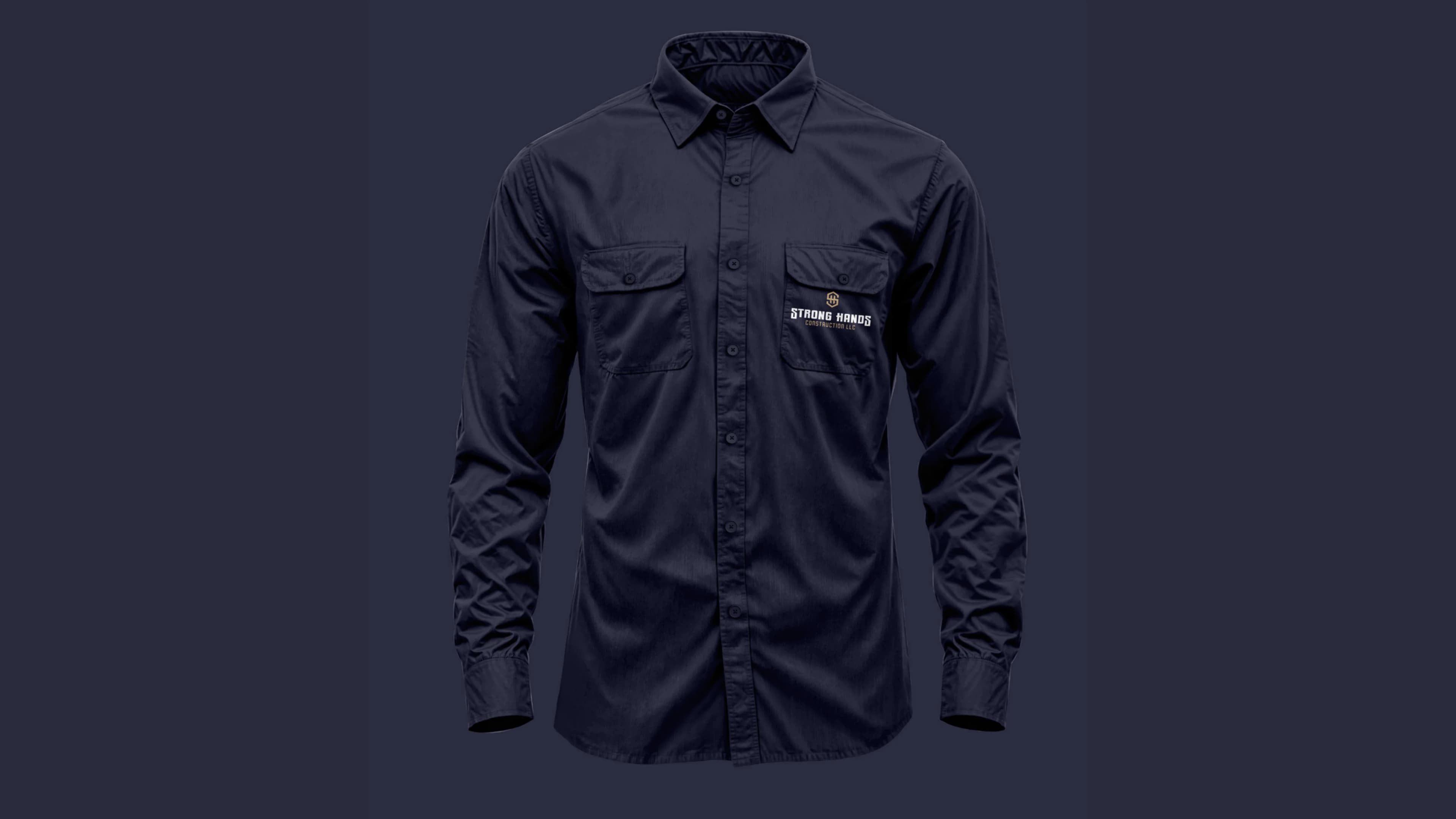
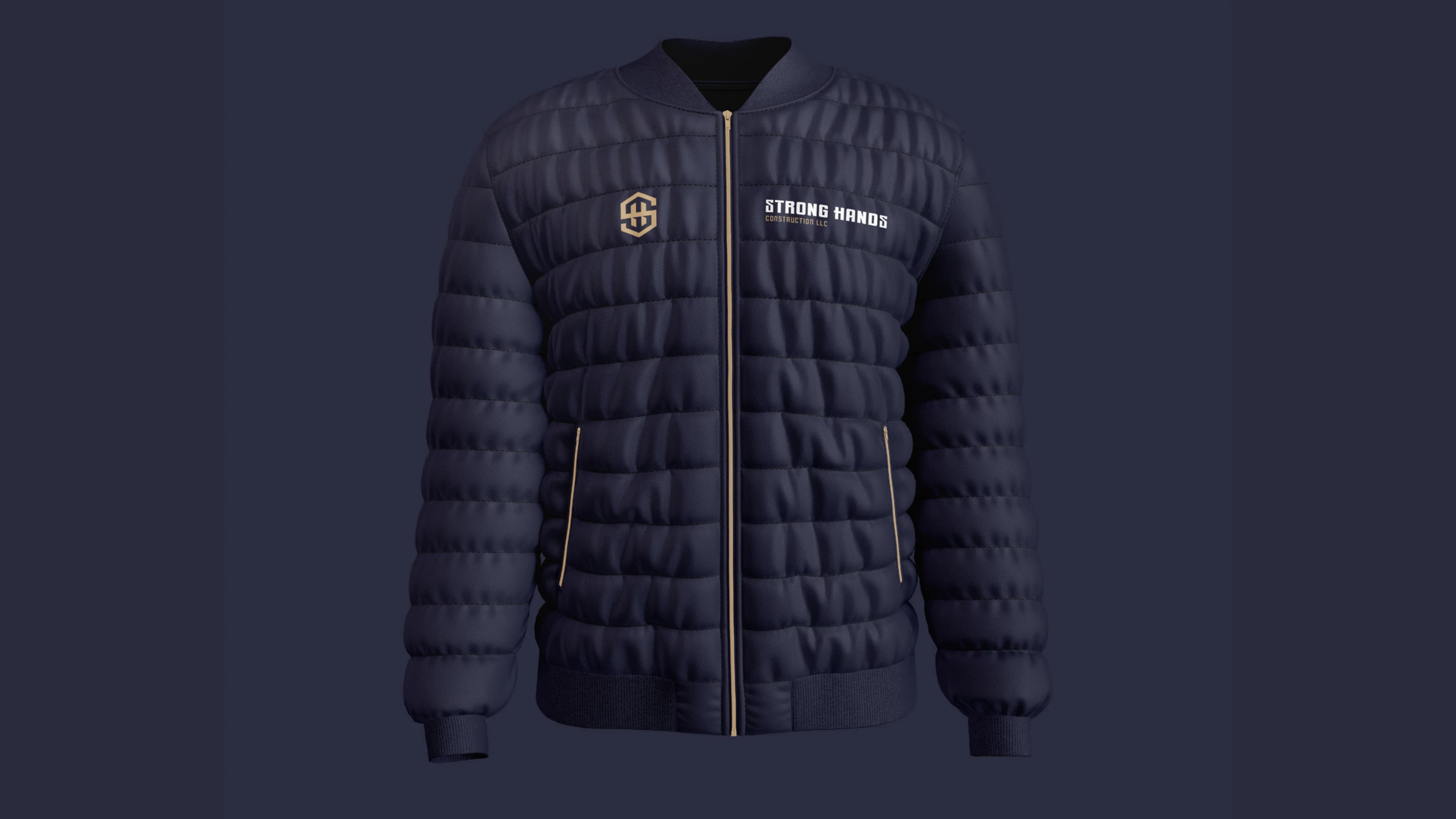
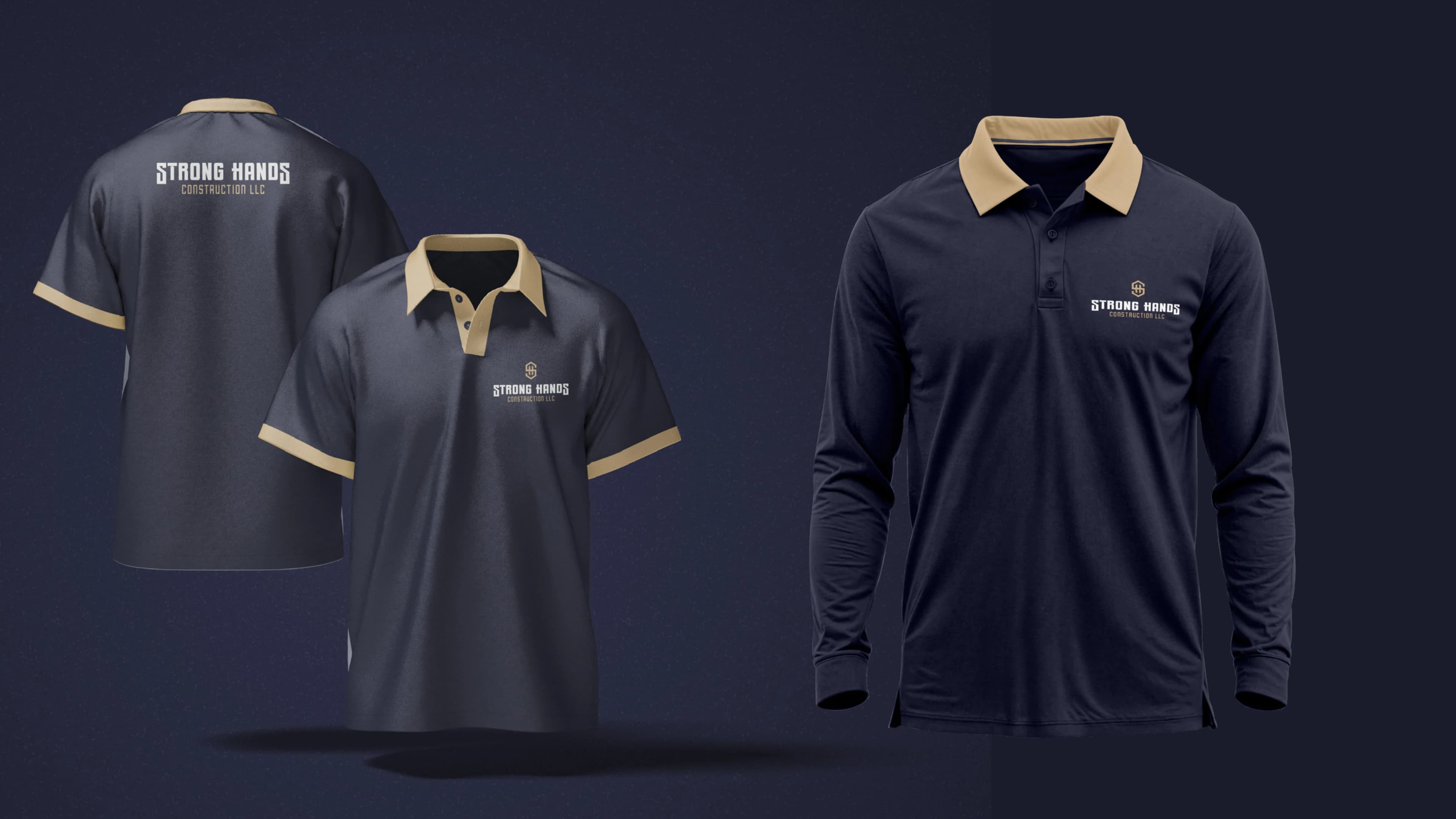
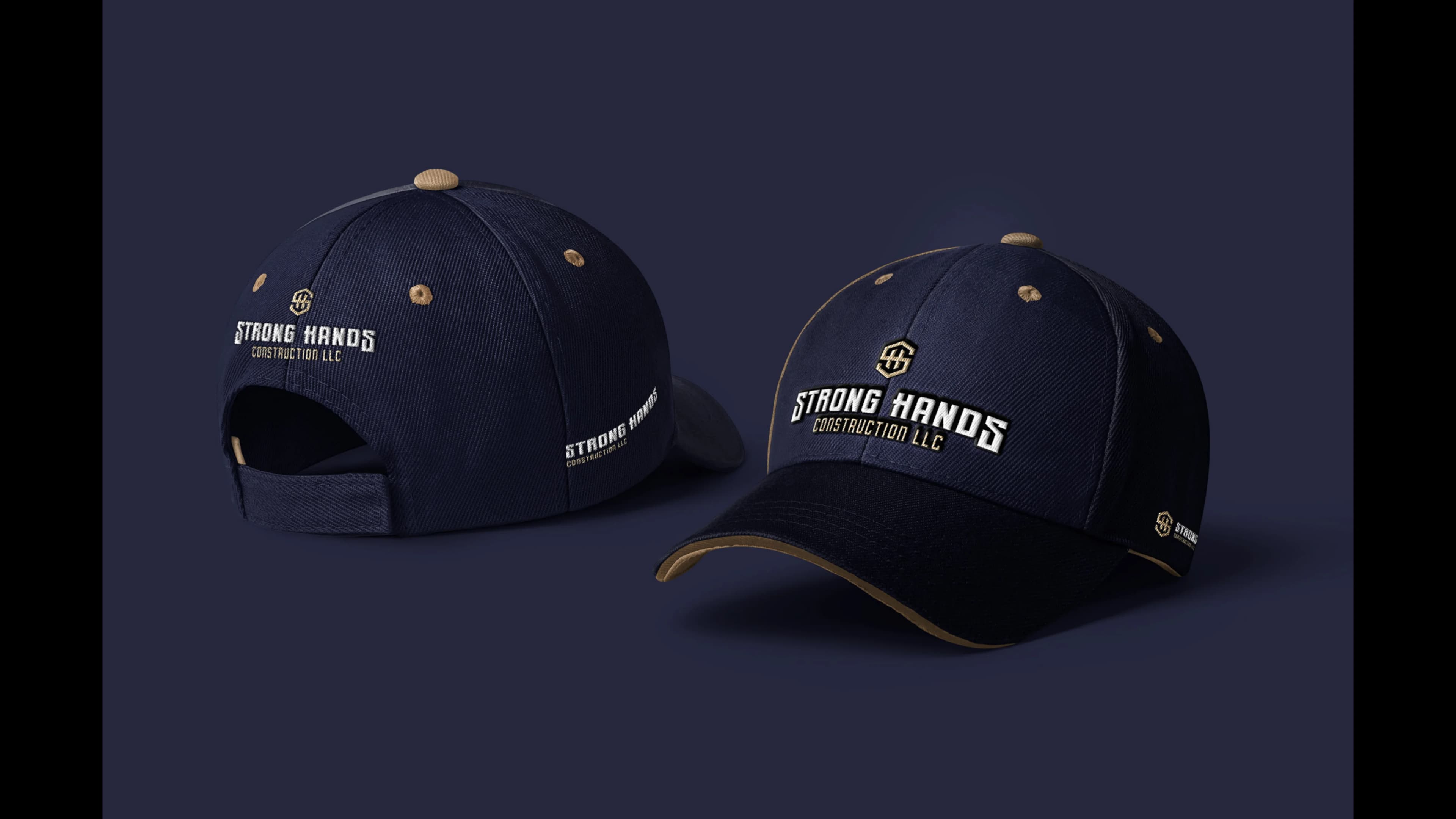
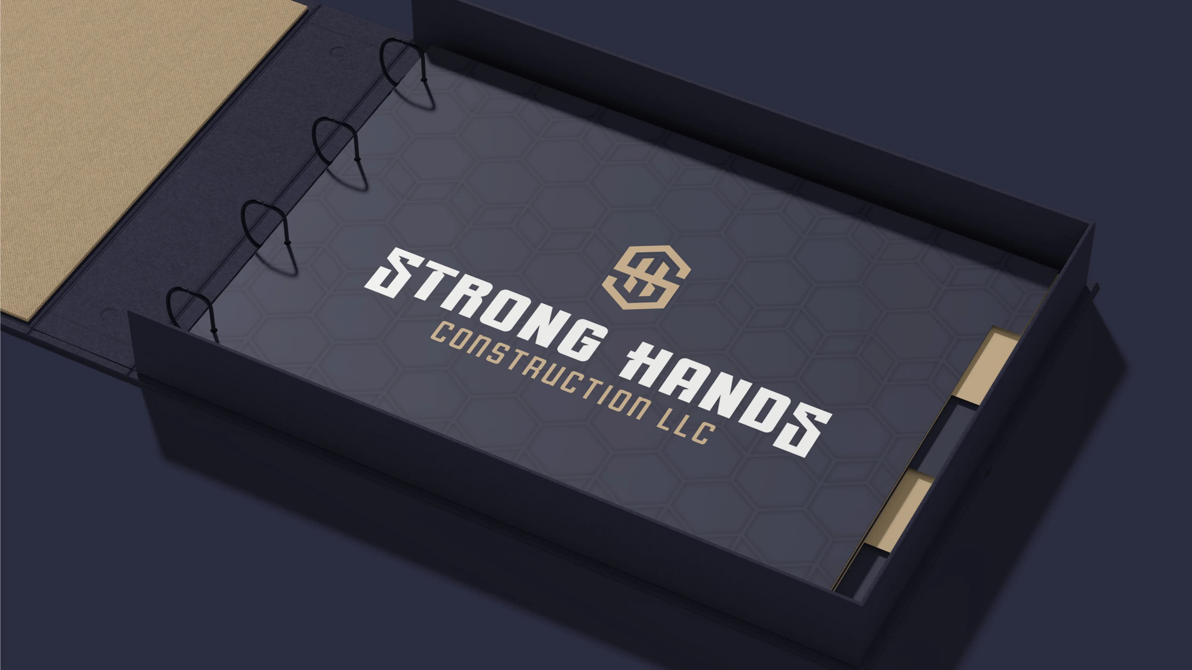
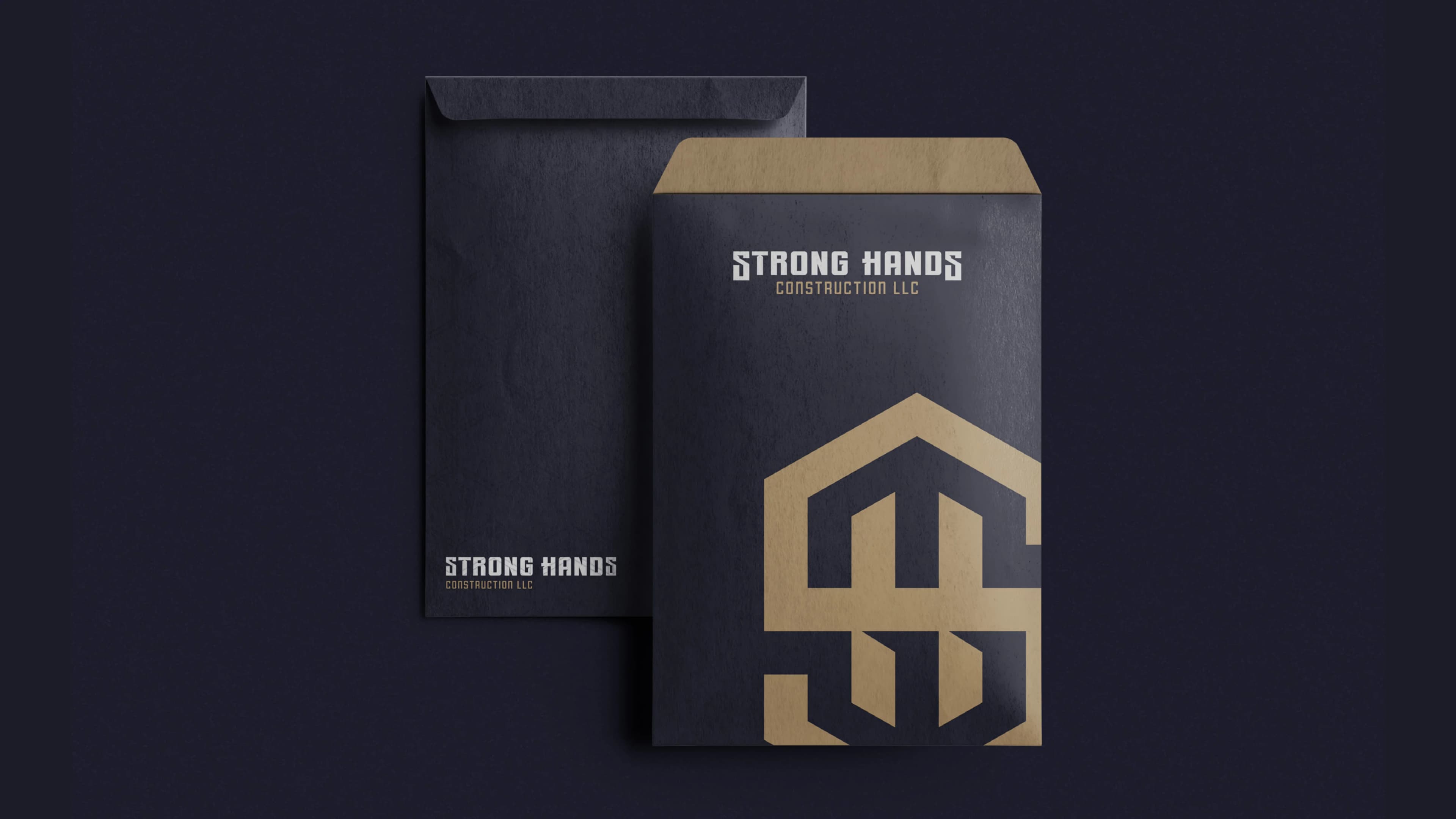
From digital touchpoints to physical collateral and jobsite apparel, experience how the Strong Hands visual identity commands authority in real-world environments.