
VISUAL IDENTITY & WEBSITE
Togo Hardscaping
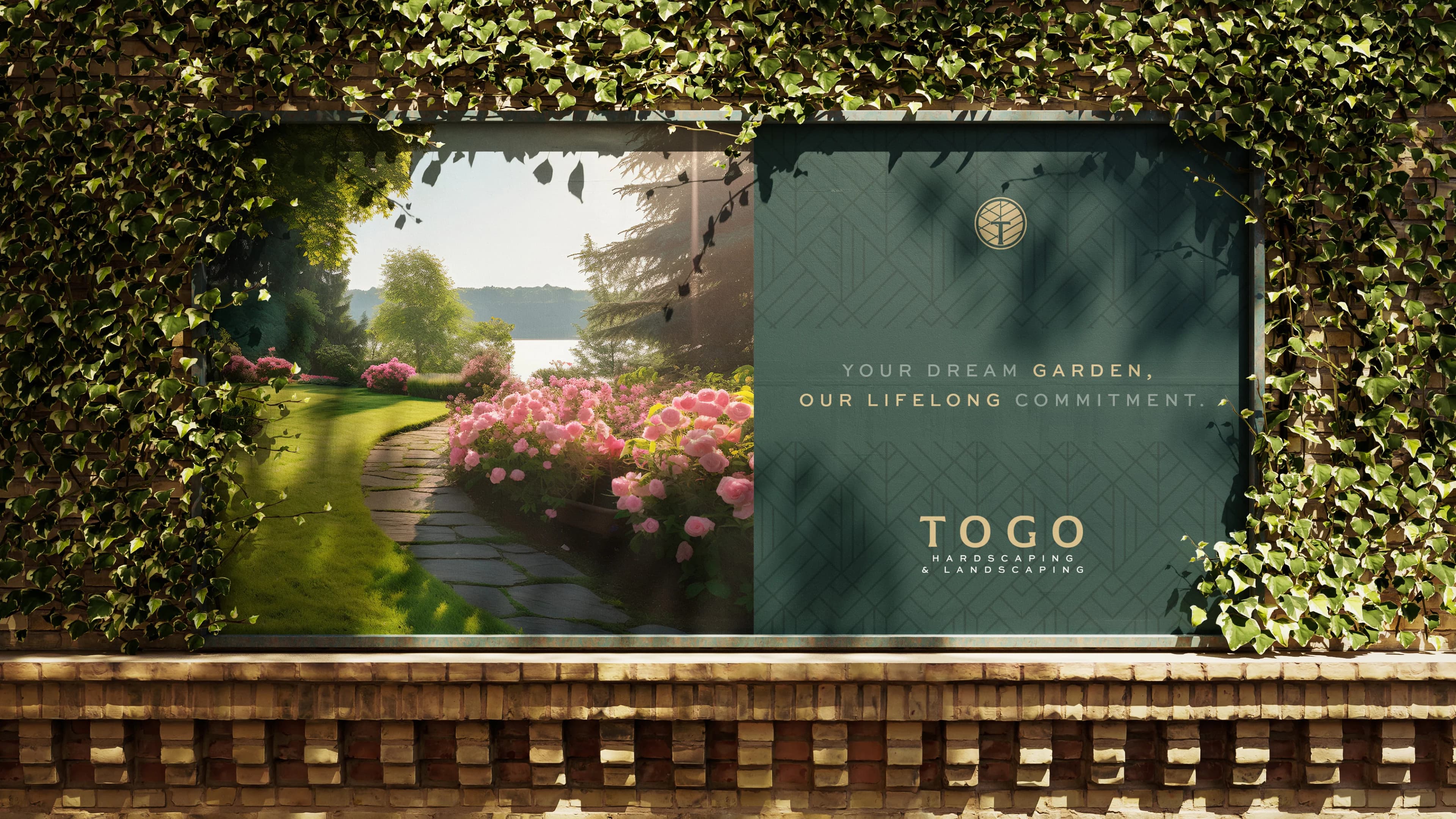
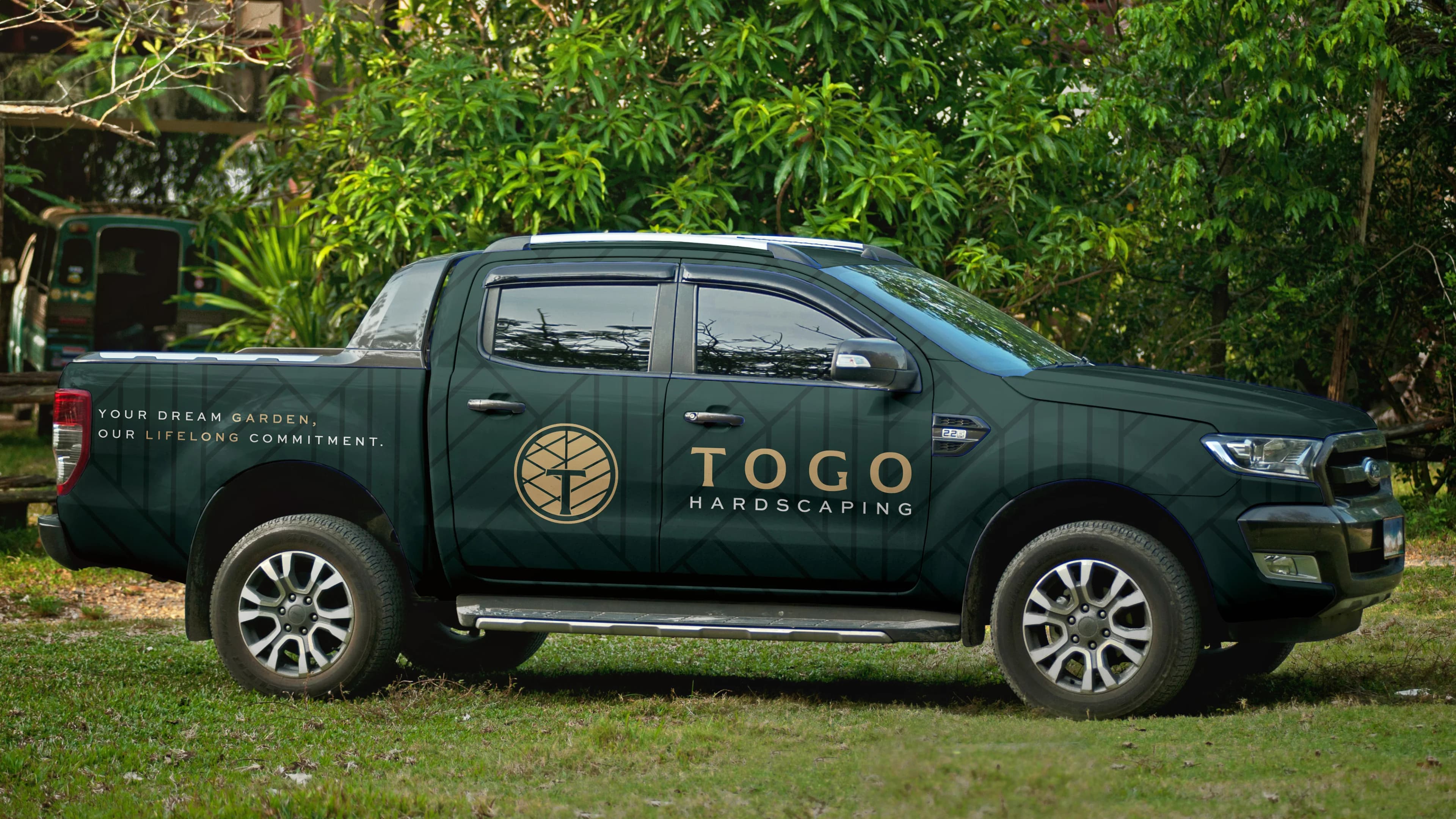
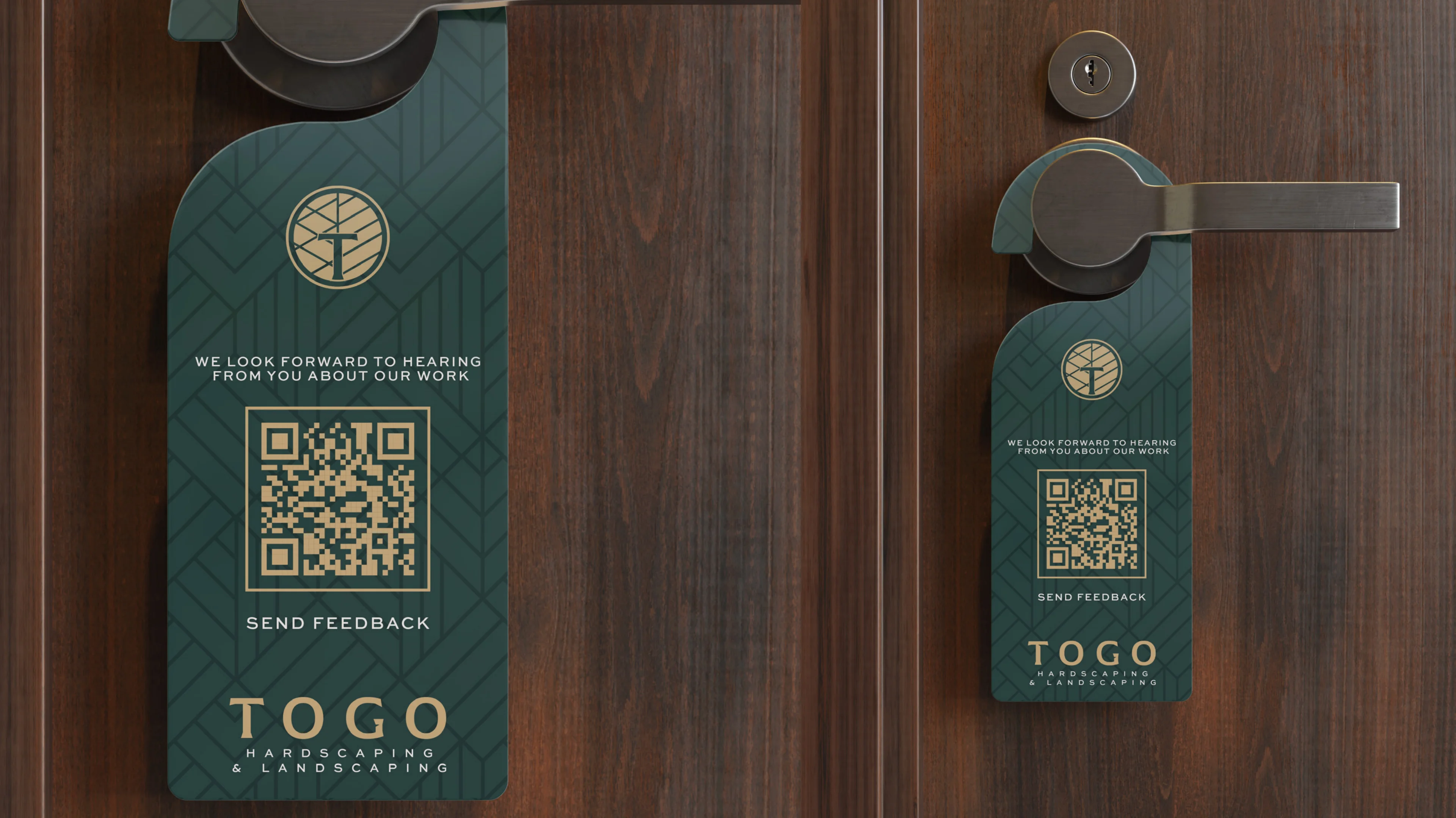
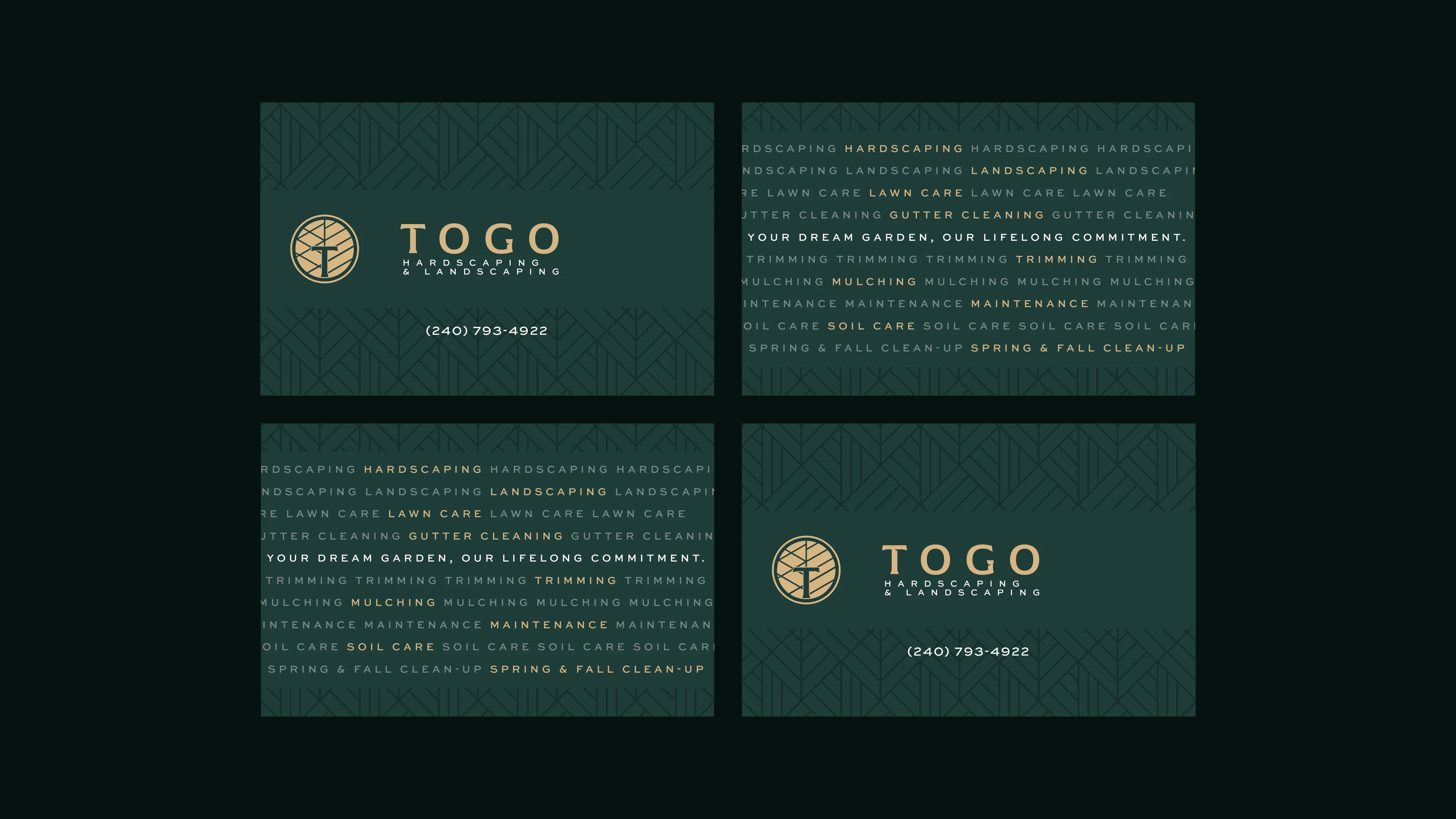
Every strategic choice, from color psychology and typographic weight to digital user experience and web design, was made with purpose and precision, ensuring Togo Hardscaping's identity and online presence communicate exactly what its audience needs to feel: trust, elegance, and uncompromising quality.
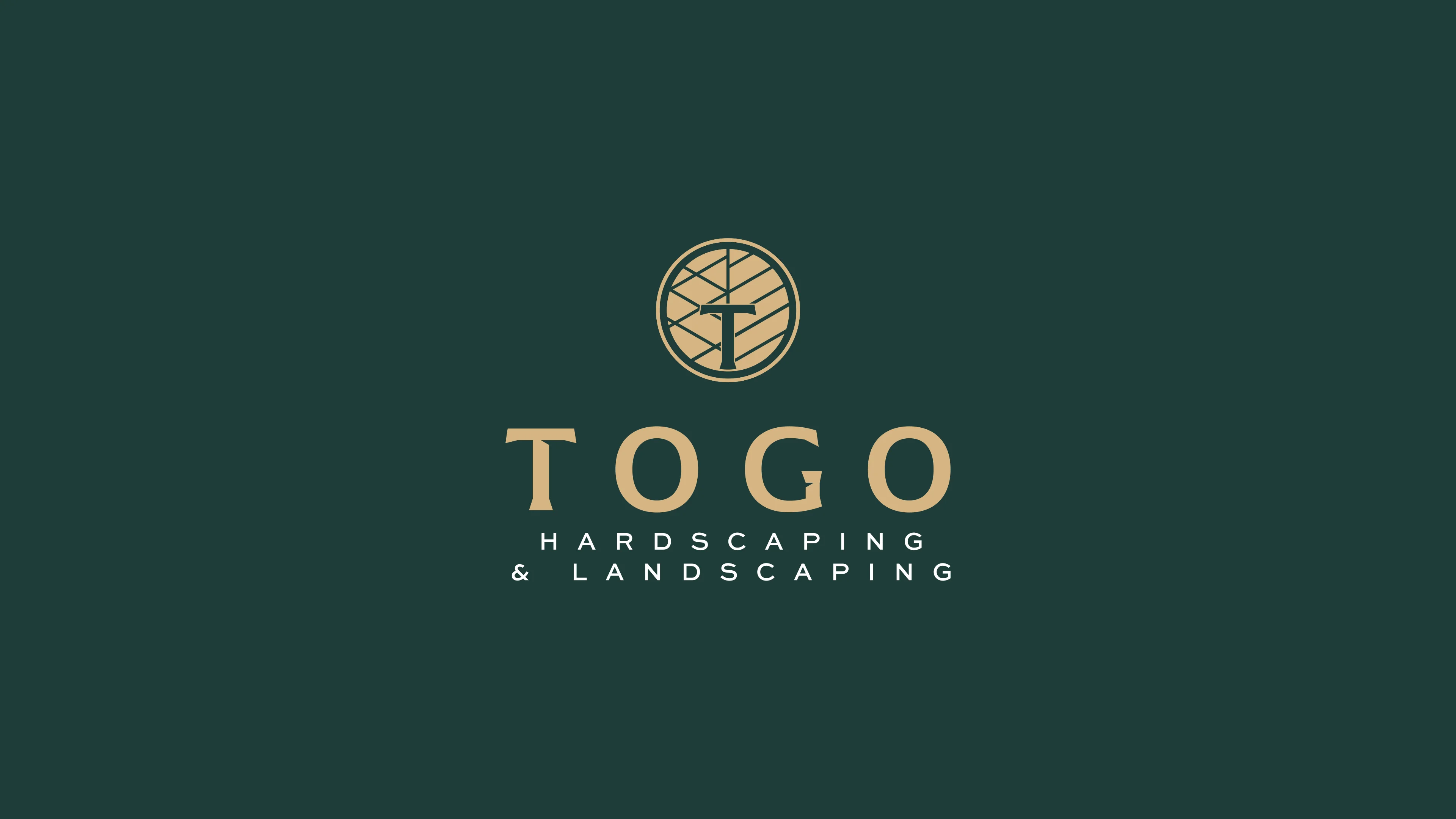
Graphic and conceptual construction of the Brand
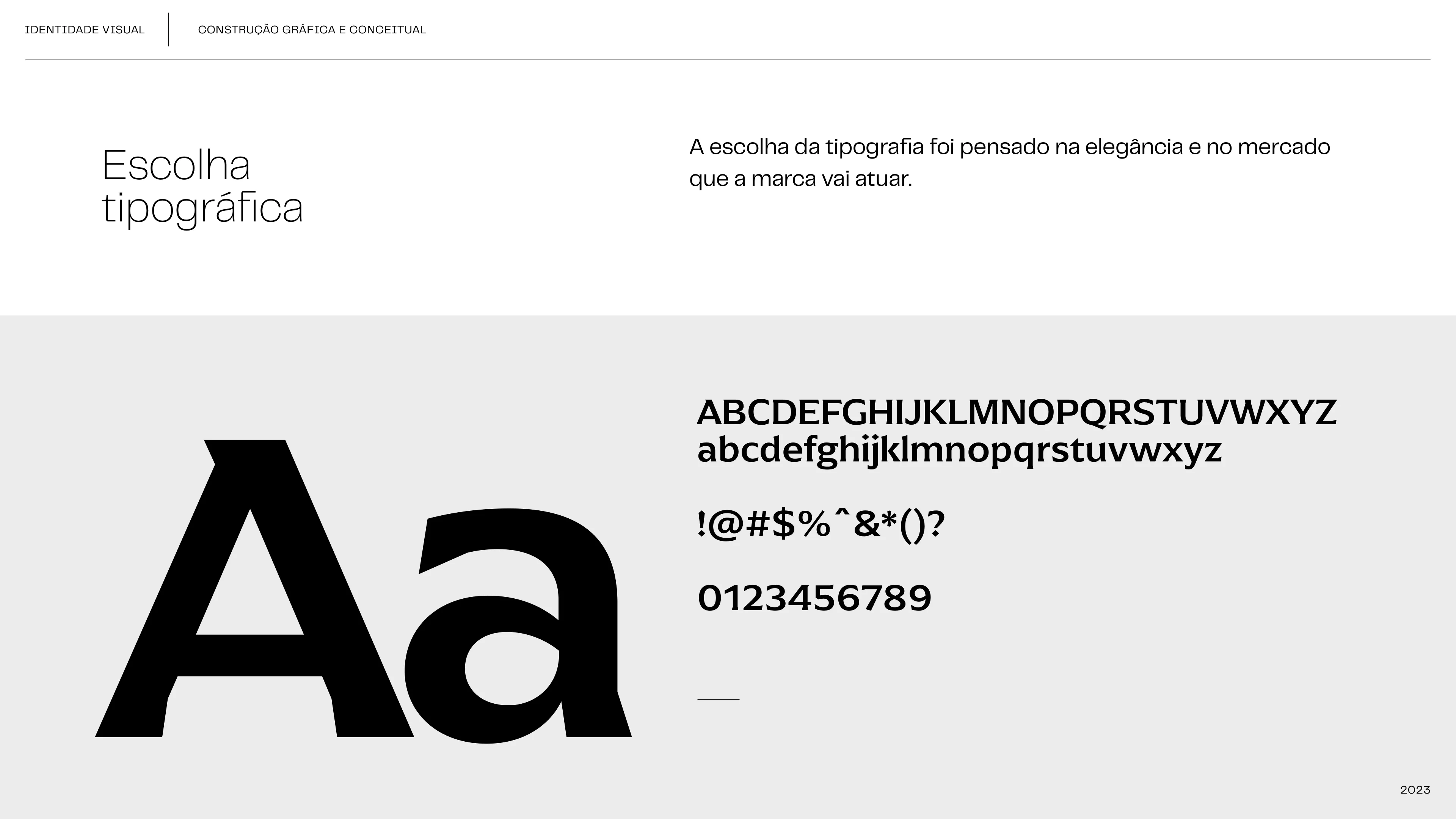
Typographic Choice
The choice of typography was based on elegance and the market in which the brand will operate.
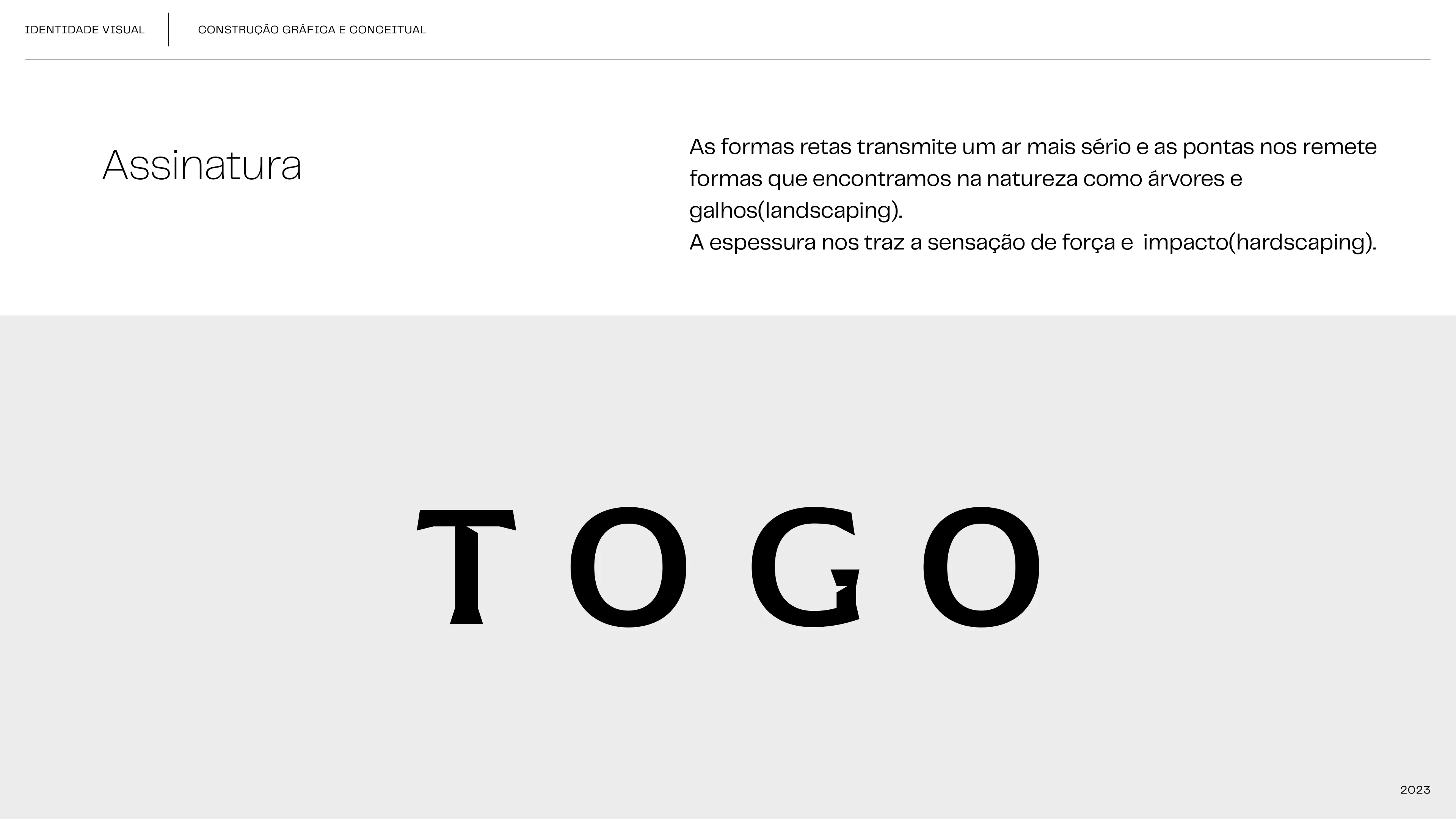
Signature
The straight forms convey a more serious air and the tips remind us of forms found in nature such as trees and branches (landscaping). The thickness gives us the feeling of strength and impact (hardscaping).
Concept and Symbology
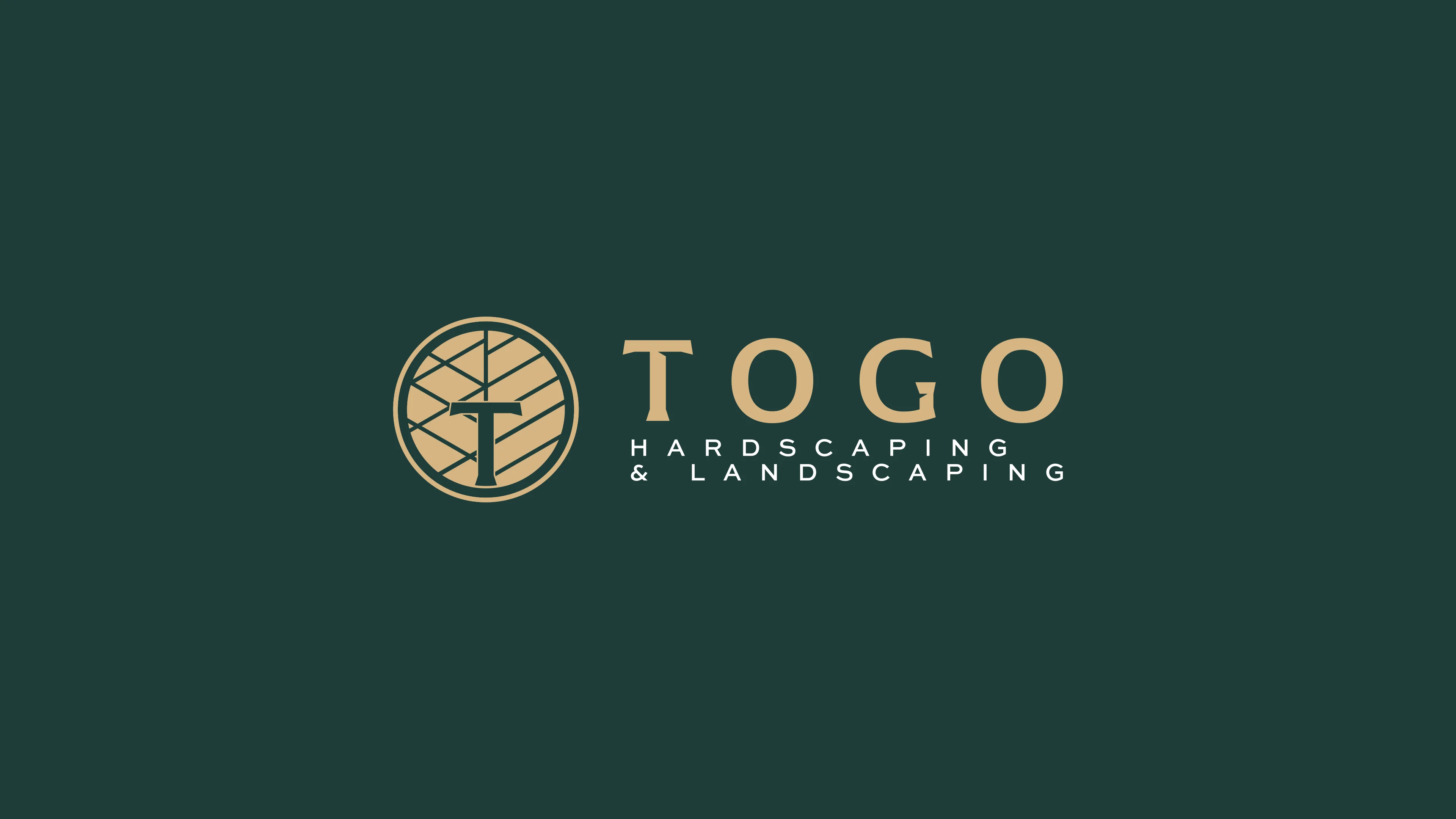
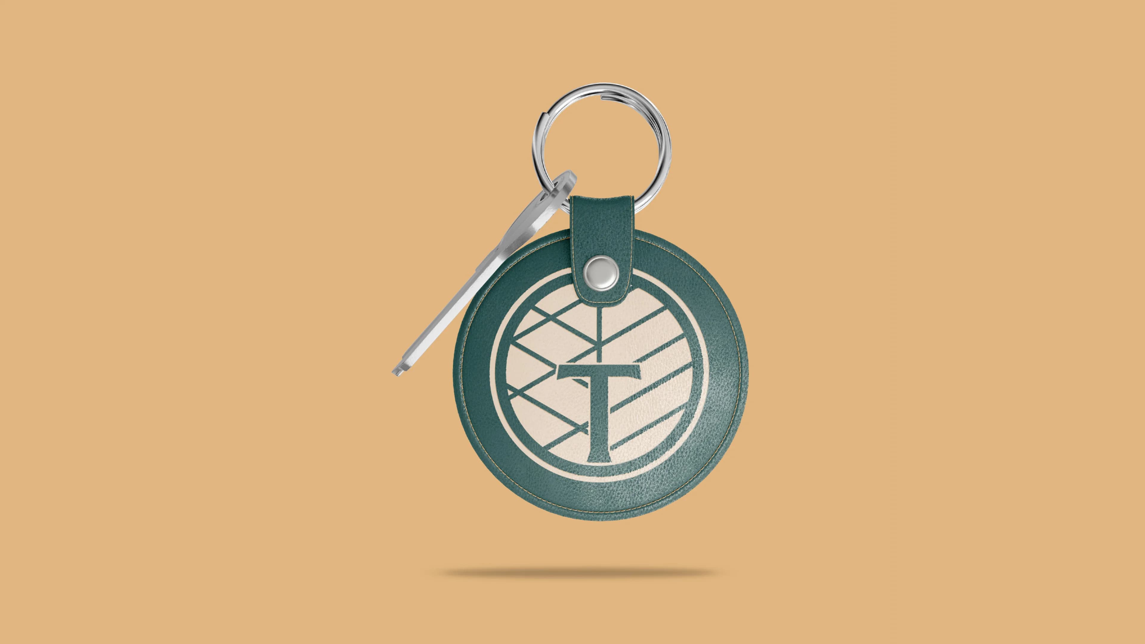
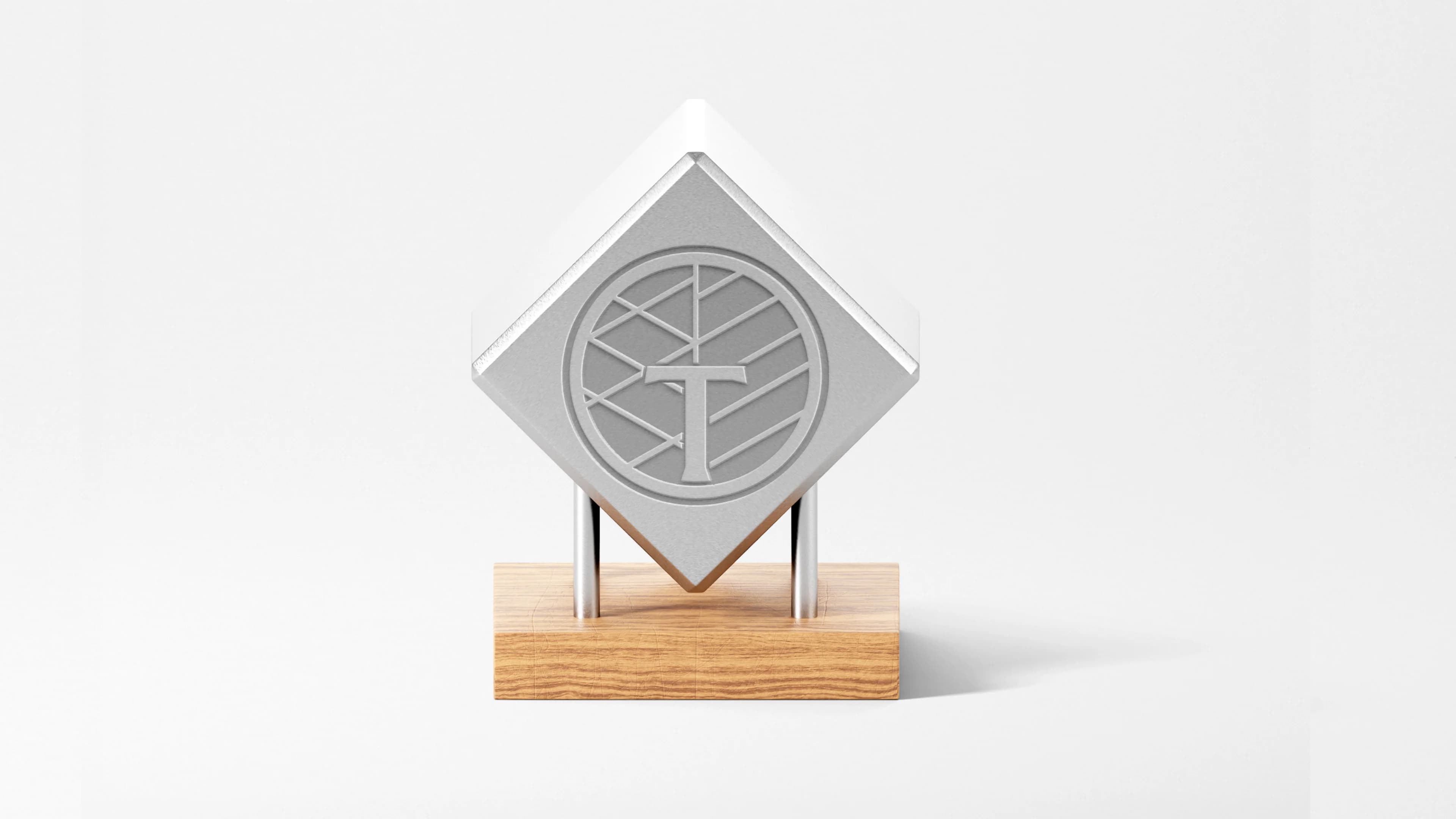
Concept and symbology: For the construction of the symbol, we used forms that carry the DNA of hardscaping and landscaping.
We used the initial T to give identity to the symbol and joined it with the selected elements that are always present in the services provided by Togo.
 Final symbol
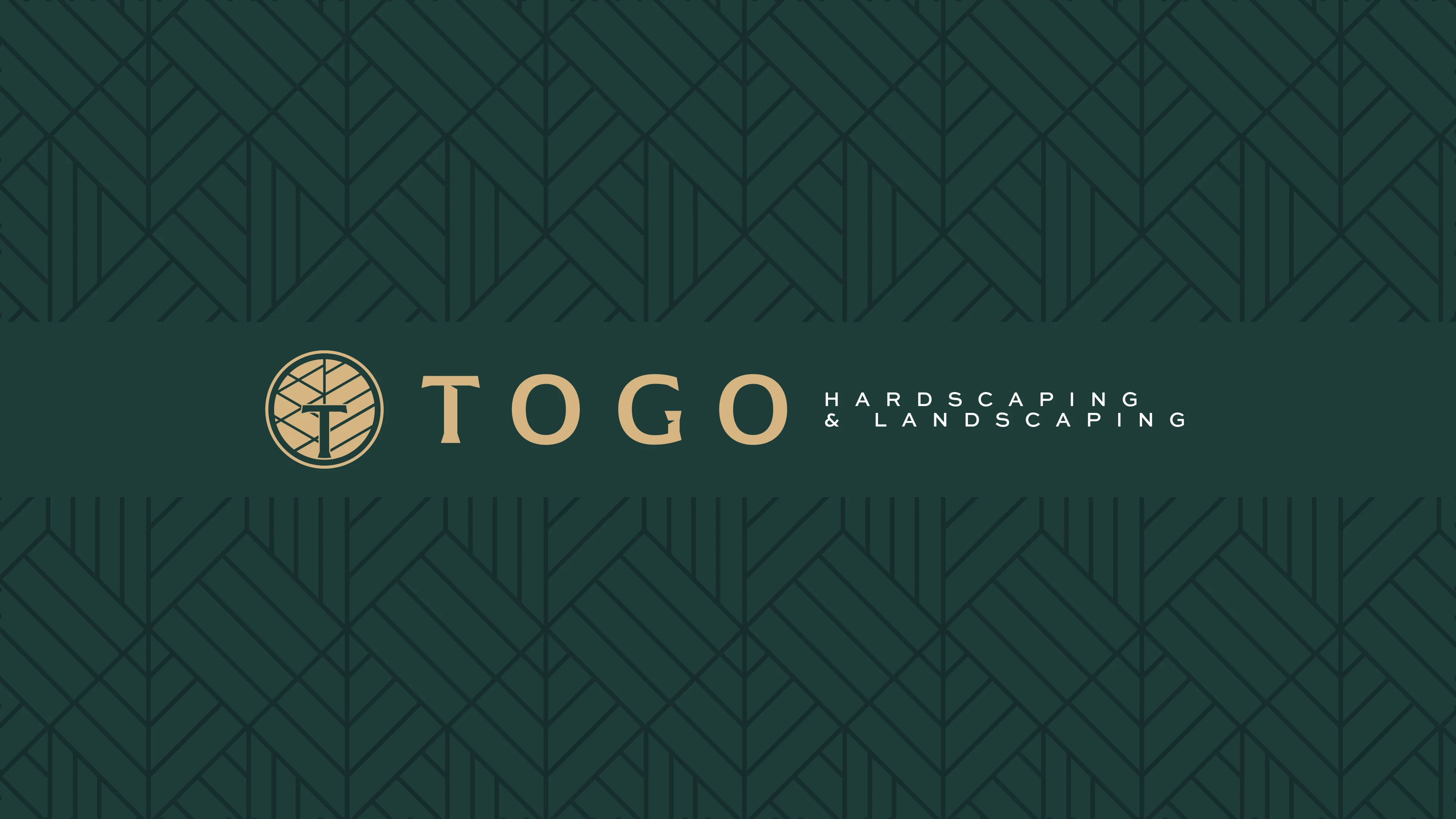
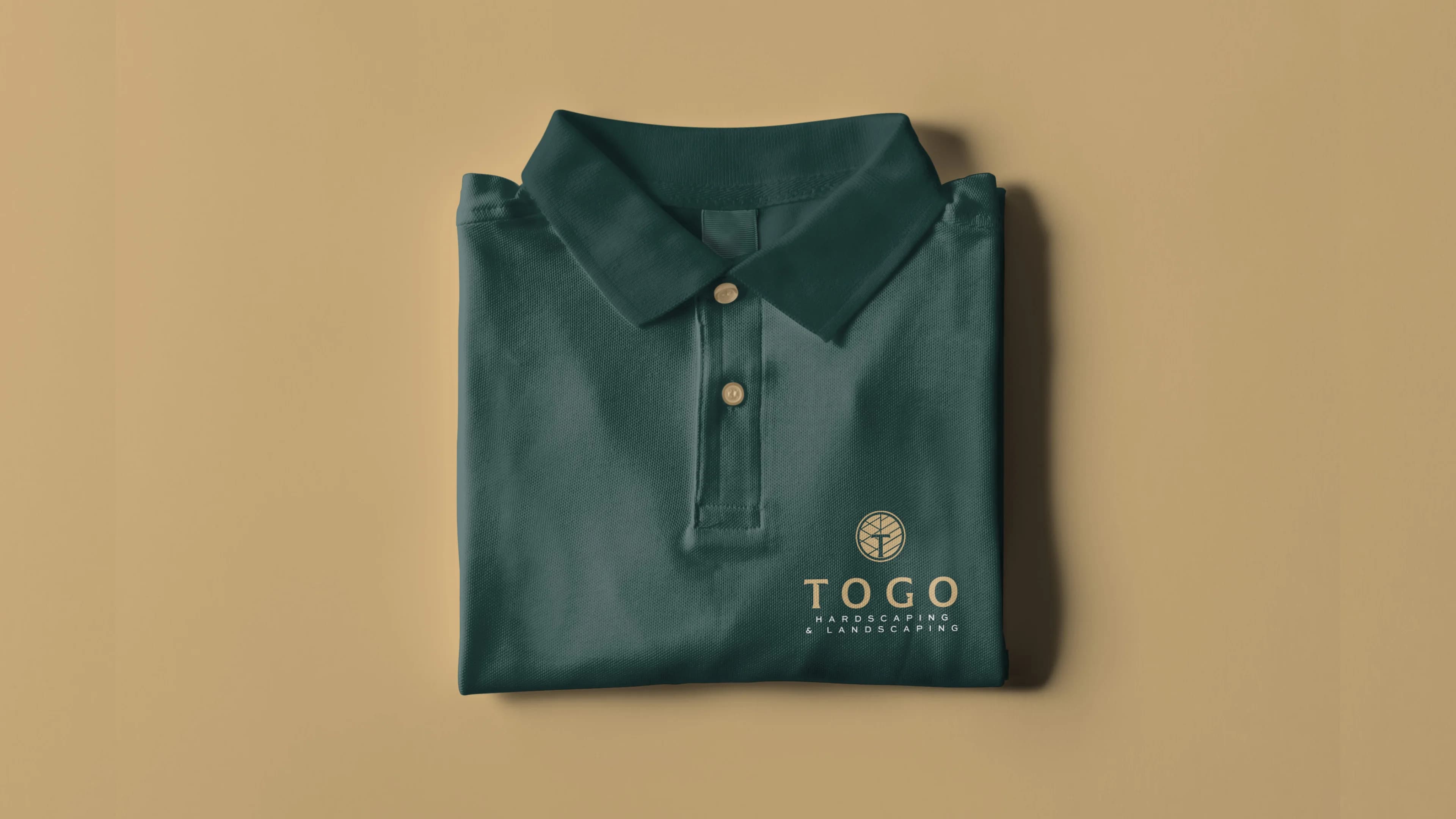
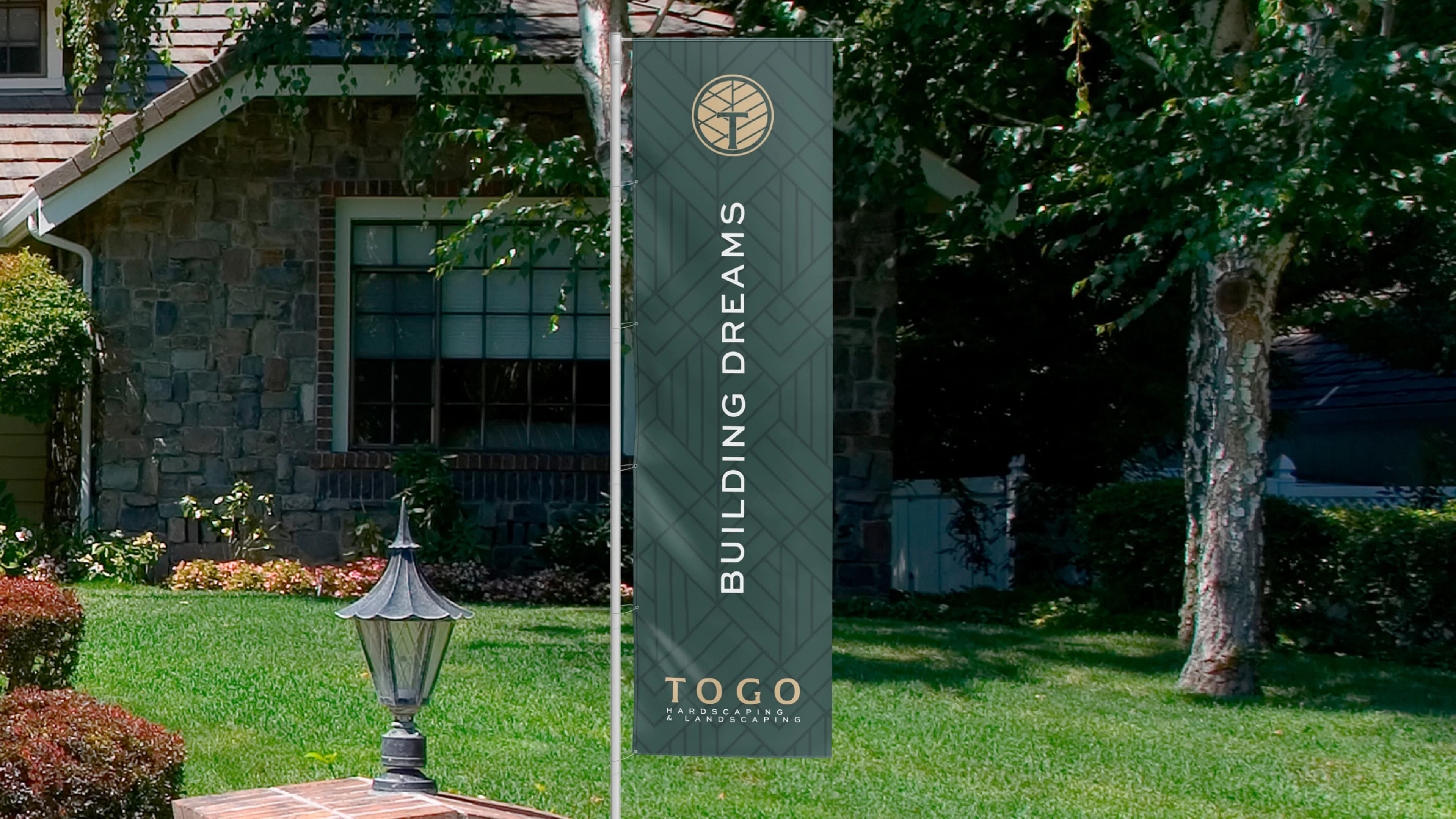
 Main combined mark
Palette of primary colors
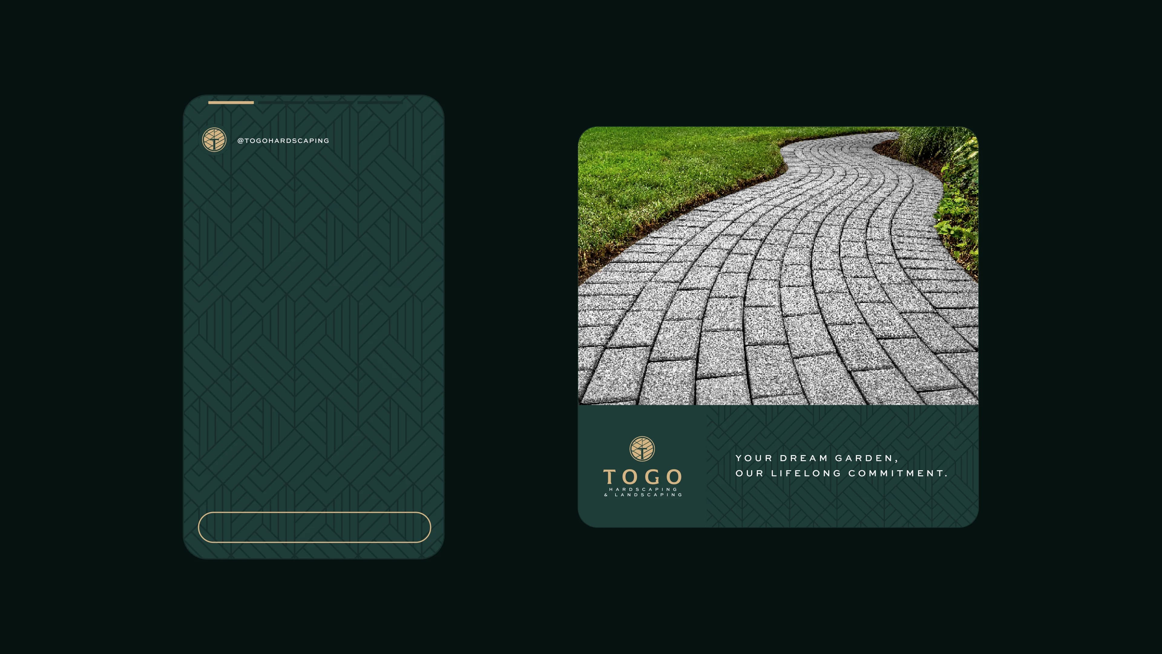
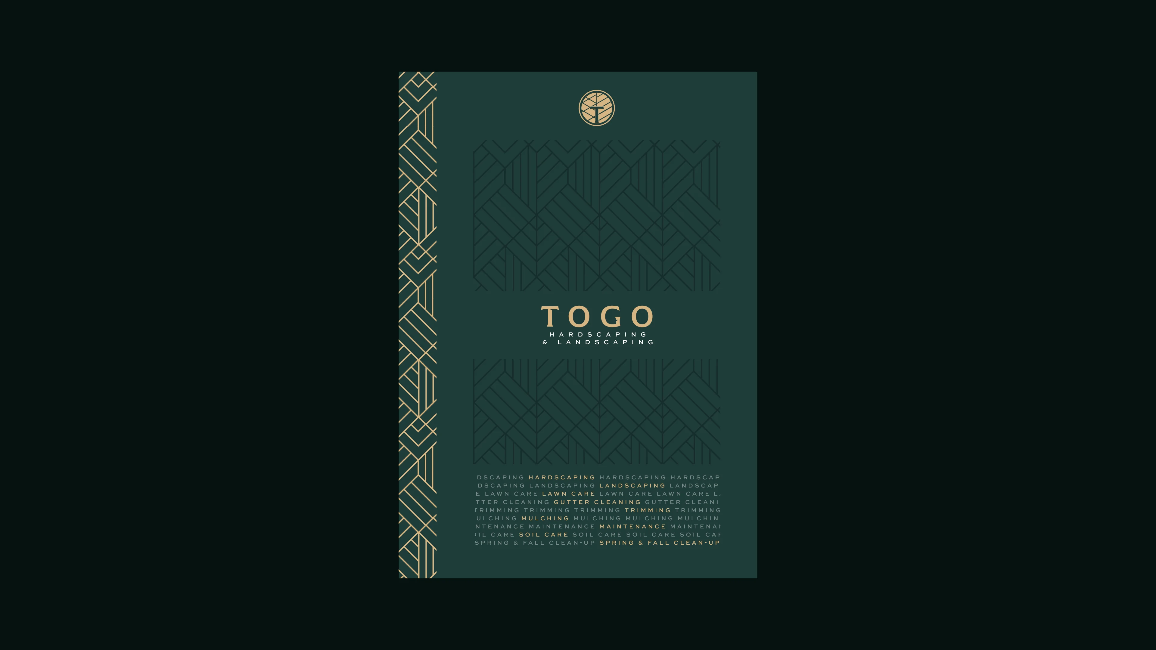
As the main color, we used green with a more sober tone, and to complement the color palette, we used a shade of gold that allows for good contrast and brings all the elegance the brand needs to communicate with its audience.
Official Website
Studio C engineered a custom, high-converting website for Togo Hardscaping & Outdoor Living, seamlessly connecting their refined visual identity with a modern digital client intake portal. Designed for maximum speed, local Massachusetts SEO dominance, and mobile-first responsiveness.
Ready to Transform Your Brand?
Let's build a powerful, market-leading visual identity, website, and social media presence for your business.